Ever opened a site on your phone and it looked squished or broken? That’s a missed opportunity. In today’s world, a website must adapt to any screen size – from a big desktop monitor to a tiny smartwatch. The good news? Making a site responsive isn’t a mystery. With a few clear steps, you can deliver a smooth experience that keeps visitors clicking.
First off, Google favors sites that load quickly and look good on mobile. If your pages are hard to read on a phone, search rankings slip and traffic drops. Users also form opinions in seconds; a site that forces them to pinch‑zoom will lose them fast. Responsive design solves both problems by using flexible grids, scalable images, and media queries that adjust layout based on the device.
Beyond SEO, responsive sites cut maintenance costs. Instead of juggling separate desktop and mobile versions, you manage one codebase. Updates, security patches, and content changes happen once, saving time and money. It’s a win‑win for businesses and developers.
Start with a mobile‑first mindset. Design the smallest screen first, then add breakpoints for larger devices. This forces you to prioritize essential content and avoids clutter.
Use a flexible grid system. Percent‑based widths let columns stretch or shrink automatically. For example, set a container to width: 100%; and let inner columns use width: 50% for a two‑column layout on tablets, then switch to width: 100% on phones.
Media queries are the heart of adaptation. A simple query like @media (min-width: 768px) { … } applies styles when the viewport reaches tablet size. Use them to change font sizes, hide non‑essential elements, or rearrange navigation.
Images often cause slow loads. Serve responsive images with srcset and sizes attributes so browsers pick the optimal file. Compress images, use modern formats like WebP, and consider lazy loading for below‑the‑fold content.
Test early and often. Resize your browser window, use device emulators, or grab a phone to check real‑world performance. Free tools like Chrome DevTools’ device mode or online responsive checkers give instant feedback.
Finally, keep performance in mind. Reduce CSS and JavaScript bloat, enable caching, and use a content delivery network (CDN). A fast, responsive site feels smoother and keeps users engaged longer.
By following these steps, you’ll create a site that looks great on any device, ranks higher in search, and costs less to maintain. Ready to upgrade your web design? Start with a quick audit of your current layout, apply the techniques above, and watch your visitor numbers climb.
The cost of website design varies from $500 to over $100,000 depending on features, complexity, and expertise. Learn what you actually get at each price point and how to avoid costly mistakes.
Read More
Google Web Designer doesn't automatically make ads responsive-you have to build it in. Learn how to create mobile-friendly HTML5 banners with breakpoints, optimized images, and real device testing.
Read More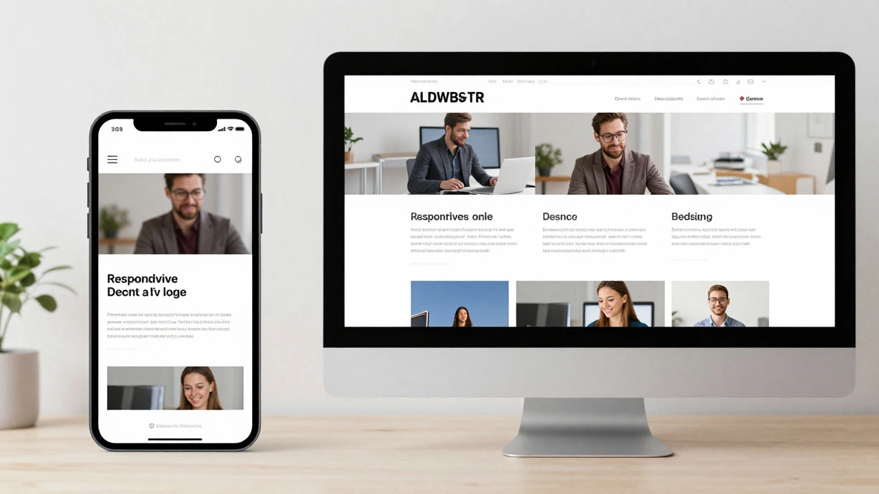
Responsive websites adjust layout for screen size; dynamic websites change content based on user or context. Learn how they differ and which one your project needs.
Read More
Responsive web design lets sites adapt to any screen size. Learn core techniques, step‑by‑step setup, common pitfalls, and FAQs to build fluid, mobile‑first experiences.
Read More
Discover the top 10 reasons why responsive web design is essential, from boosting SEO and conversions to cutting maintenance costs and future‑proofing your site.
Read More
Explore what truly defines responsive design in 2025, why it matters, how it works, and how you can make your website more user-friendly for every device.
Read More
Creating an HTML website that seamlessly adapts to any device ensures optimal user experience and accessibility. This guide delves into effective strategies for achieving cross-device compatibility in web design. Learn how to utilize flexible layouts, implement media queries, and optimize images for responsiveness. Discover essential tips and common pitfalls to avoid when crafting a versatile and dynamic website.
Read More
A responsive website adapts seamlessly across various devices and screen sizes, which is crucial in today's diverse tech landscape. This article delves into the importance of having a responsive design, explains simple methods to test a website's responsiveness, and highlights useful tools that facilitate these checks. Understanding the signs of a responsive site ensures your audience gets the best user experience. With these insights, web developers and site owners can ensure their content remains accessible and engaging for every visitor.
Read More
Transforming an existing website into a responsive one involves adapting its layout and functionality to offer an optimized experience across different devices and screen sizes. This process includes examining the site's current structure, applying flexible grids, utilizing media queries, and ensuring touch-friendly interfaces. Emphasizing a mobile-first approach can lead to a more user-centered design, increasing visitor engagement and retention. The right tools and strategies are crucial for successfully transitioning your website into a fully responsive one.
Read More
Creating a responsive website is vital for delivering a seamless user experience across all devices. This guide explores the essential elements of responsive web design, focusing on flexible layouts, media queries, and performance optimization. Learn how to ensure your site adapts to different screen sizes without compromising functionality. Dive into the world of mobile-friendly navigation and discover best practices for responsive images.
Read More
Responsive design styles have transformed the digital landscape by allowing web designs to adjust seamlessly to various screen sizes. This approach ensures enhanced user experiences across devices, from desktops to smartphones. The article dives into key aspects of responsive design, offering insights into popular techniques and important considerations for designers. Tips on optimizing content and choosing the right frameworks are also discussed.
Read More