
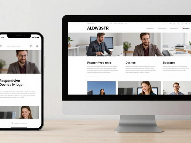
In a world where technology evolves at lightning speed, ensuring your website is responsive has never been more crucial. Whether you're browsing on a sleek smartphone or a hefty desktop, a site should offer a seamless experience.
Wondering how to make sure a website is up to the task? Let's dive into the straightforward steps that can show you just how adaptable a website is across different screens.
- Understanding Responsive Design
- Methods to Test Responsiveness
- Using Online Tools
- Importance of Mobile-Friendly Sites
Understanding Responsive Design
Responsive design is more than just a tech buzzword; it's a critical element to any modern web development strategy. With the diversity of devices that users employ to access the internet today, from smartphones and tablets to laptops and desktops, ensuring that your website maintains functionality and aesthetic appeal across all platforms is essential. Over 50% of global web traffic now originates from mobile devices, a statistic that underscores just how important responsive design has become. A website that fails to accommodate a variety of screen sizes risks alienating half of its potential audience. The core principle of responsive design is fluidity, allowing a website to expand or contract seamlessly based on the device's screen size. This is achieved through a combination of flexible grids, scalable images, and CSS media queries that detect the viewer's environment.
Historically, the term 'responsive design' was coined by Ethan Marcotte in 2010, revolutionizing the way web developers approached site design. Prior to this, creating separate mobile versions of a site was common practice, which was labor-intensive and led to inconsistencies in user experience. By leveraging CSS media queries, Marcotte demonstrated that a single codebase could adapt visually and functionally without the need for separate design paths. Importantly, responsive design is not merely about aesthetics; it's also crucial for SEO. Google has long indicated that mobile-friendly websites perform better in search ranking. A page that adjusts naturally to any screen size provides a superior user experience, reducing bounce rates and increasing the time users spend on the site.
Beyond basic resizing and realignment, there are nuances to responsive design that are worth noting. For instance, the principle of responsive typography ensures that text remains legible without requiring the user to zoom in or out excessively. Options like relative unit sizes (em and rem) instead of fixed units (px) allow for more adaptable text elements. Images and video content must also be optimized for responsivity. This means using CSS properties like max-width set to 100 percent to ensure visual media scales within a grid. The choice of a responsive grid framework can also make a significant impact. Libraries such as Bootstrap or Foundation, though not absolutely necessary, provide a foundation that can accelerate the development process.
"Design is not just what it looks like and feels like. Design is how it works." — Steve Jobs
Responsive design involves strategic thinking and planning. The challenge is to prepare content in a way that it remains striking and functional as it transitions across various devices. A superior responsive design acknowledges and respects the user's interaction regardless of the screen size. When done correctly, it can not only prevent user frustration but also enhance engagement. These elements have propelled responsive design from a nice-to-have feature to a priority in website development. As consumer reliance on multiple devices continues to grow, a commitment to a responsive web design approach hasn't just become beneficial; it's indispensable.

Methods to Test Responsiveness
When it comes to ensuring your website is truly responsive, there's a buffet of methods you can indulge in, each offering a unique way to determine how well your site holds up across various devices. Let's be real, in today's digital age, seeing a website not fit into a mobile screen snugly is like wearing an uncomfortable pair of shoes. Testing responsiveness is about ensuring every visitor finds your site just as easy to use whether they're using a modest phone or a giant desktop monitor. A great way to start is by simply resizing your browser window. Manually dragging the corner of your browser to mimic different screen widths can give you the initial gut-feel check-up on responsiveness. If elements on the page adjust smoothly without cutting off content, your site is on the right path. But keep reading, there’s more nuance to uncover.
For a more detailed approach, the use of web developer tools is highly recommended. Browsers like Chrome have built-in Developer Tools that allow you to simulate different device screens. You can activate this by right-clicking anywhere on the webpage and selecting 'Inspect.' From there, tap the toggle device toolbar, which reveals a world of device emulation for your responsive design. A few clicks, and you'll see the website stretching and squashing as if you're testing it on a phone or a tablet. It's precisely these tools that empower developers to ensure content readability, navigation ease, and image scaling. Taking it a step further, numerous online platforms such as BrowserStack offer cross-browser testing. While some of these tools might have a price tag, the investment pays off as you validate how your website responsiveness meets industry standards.
Modern sites aim to be mobile-friendly, recognizing that more people access the internet through handheld devices than desktops. Google provides a Mobile-Friendly Test where you can paste your URL and check if your site qualifies. In fact, it's said more than half of Google's search results come from mobile devices. This revelation nudges site owners to prioritize their site's compatibility with smartphones and tablets. Dive deeper, and you'll find Resizer from Google, a tool that lets you visually test material design breakpoints within your browser. There's comfort in knowing your site meets the needs of a modern audience effectively.
Yet, nothing replaces real-world user feedback. Although laboratory-tested theories do plenty, actual user testing brings insights that often surprise developers. Engaging friends or colleagues to access your site on their devices can highlight practical inconveniences unnoticed by automated tools. During testing, consider reviewing statistics or implementing feedback tools to gather user experiences. Reflecting on a quote from esteemed developer Ethan Marcotte, who bridges the gap between design and function:
"Responsive design is not just about adjustable screen resolutions and automatically resizable images, but rather a whole new way of thinking about design."This perspective is fundamental in shaping how we approach testing.
Ultimately, staying on top of your game involves routinely testing and adapting to new developments in tech. The landscape of devices keeps expanding with wearables and smart objects entering the fray. Being proactive in testing ensures your web development strategies remain effective and relevant. After all, the goal is simple – make every visitor's experience smooth and enjoyable, keeping them coming back for more.

Using Online Tools
Website responsiveness isn't just about aesthetics; it's a vital aspect of functionality and accessibility. Testing for it shouldn't be a complex process, thanks to the abundant responsive design testing tools available online. These tools provide an efficient way to ensure that every element of a website is adaptable across different devices. One of the primary online tools in this domain is Google's Mobile-Friendly Test. Not only is it easy to use, but its insights are immensely valuable. Upon entering a URL, the tool examines the mobile usability of the page and offers suggestions if problems are detected, like text that is too small to read or elements that are too close together. This tool acts as an initial litmus test for mobile-friendly design.
Another excellent resource is BrowserStack, which offers a plethora of testing capabilities. This comprehensive tool allows developers to test their websites on real browsers, operating systems, and devices. Imagine gaining access to a myriad of devices right from your desktop. This flexibility ensures that potential pitfalls are identified before they affect the user experience. In fact, utilizing a tool like BrowserStack can significantly reduce the time developers spend debugging cross-browser issues, ensuring efficiency in workflow. Additionally, it supports visual testing, enabling users to compare screenshots of a site displayed on different devices.
Then there's Responsinator, a straightforward yet effective tool. It displays how a website looks on various devices such as iPhones, iPads, Kindle, and Android phones. Its simplicity is its strength, as you don't need any advanced skills to interpret how your chosen page adapts. Many developers often use it as a quick check tool when making iterative design changes because it provides instant feedback. This rapid feedback mechanism helps teams stay agile in their development processes.
If you’re keen on a more detailed analysis, consider using GTmetrix. While primarily known for its page speed insights, GTmetrix also provides detailed reports on responsive performance aspects. It evaluates site elements like image sizing, script behavior, and layout performance on different devices. Evaluating these metrics can offer a deeper understanding of potential bottlenecks that could impede a web development team's ability to craft perfect responsive experiences. Not to mention, GTmetrix's visually appealing reports can serve as excellent communication tools with stakeholders, showing tangible results of design optimations.
The usefulness of these tools can’t be overstated. Through accurate, automated checks, developers today can avoid the painstaking process of manually checking a site on multiple devices. In the words of Jim Daniels, a well-regarded web development expert, "Automation doesn’t replace creativity; it amplifies it." Optimal usage of these online resources allows developers to focus more on creative design aspects, knowing the technicalities are always being set right.

Importance of Mobile-Friendly Sites
It's hard to overstate how critical it is for businesses to have a mobile-friendly presence in our digitized world. More than half of global web traffic is generated from mobile phones; a fact that underscores the importance of ensuring your website is easily accessible on smaller screens. In a market where users can abandon a website faster than ever due to poor loading times or unreadable layouts, having a responsive design is not just a bonus—it’s a necessity.
The concept becomes even clearer when you consider that Google prioritizes mobile-friendly sites in its search results. This means a non-responsive site might not just irritate users; it might struggle to reach them in the first place. Several studies have revealed that users are more likely to trust and purchase from businesses that offer seamless browsing experiences across all their devices.
Take for example an online store, crammed with compelling products but suffering from an unresponsive layout. Potential customers may click away in frustration if they can't navigate comfortably on their phones, meaning lost sales and negative impressions. Being mobile-friendly can enhance user engagement and lead to higher conversion rates. A sluggish, frustrating user experience can dent your brand's credibility irreparably.
"The mobile-first approach isn’t just about optimizing the design, it’s about thinking differently about how you solve problems and design solutions." - Luke Wroblewski, Product Director at Google
Let's not forget how business landscapes have transformed post-pandemic. As we’ve leaned more heavily on digital frameworks, adapting to mobile-browser demands isn’t optional anymore; it's a must-have. Imagine someone checking their emails on their phone during a commute, spotting a marketing email about your product, and clicking a link to your site. If the site isn’t responsive, both the opportunity and that potential customer might be lost forever.
To better understand this shift, consider this data: a 2019 study by Statista found mobile internet usage is expected to rise from 62% to 67% by 2025, indicating an unrelenting demand for content that is easy to engage with on mobile devices. Catering to this demand could be the difference between a thriving internet presence and an online ghost town.
In simpler terms, if you’re building or overseeing a website, always ask the question: Does it work beautifully on a phone? The answer to that question gives you insight into how your web development strategies might need to change to keep up with user expectations and maintain a strong online footprint.