Responsive Design Benefits Calculator
This tool estimates the potential business impact of responsive web design based on key benefits. Enter your current monthly metrics to see projected improvements.
Projected Improvements with Responsive Design
SEO Boost
+25% increase in organic traffic
Projected: 0 sessions/monthHigher Conversions
+30% improvement in conversion rate
Projected: 0 conversions/monthLower Maintenance
50% reduction in maintenance efforts
Projected: $0 saved/monthMobile Experience
+40% faster mobile load times
Core Web Vitals: ImprovedOverall Impact Summary
Implementing responsive web design could potentially increase your organic traffic by 25%, improve conversion rates by 30%, reduce maintenance costs by 50%, and significantly enhance mobile performance metrics.
Key Takeaways
- Responsive web design (RWD) improves user experience on any device.
- Google rewards mobile‑friendly sites with higher rankings.
- Conversion rates climb when layouts adapt to screen size.
- Maintaining one codebase cuts development and upkeep costs.
- RWD future‑proofs your site against new devices and screen resolutions.
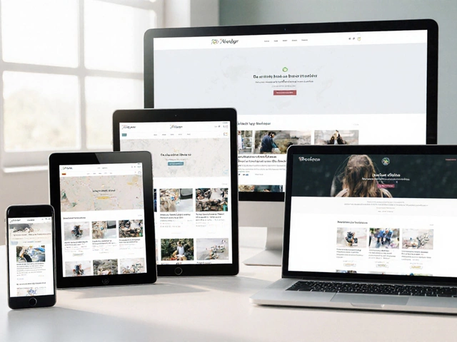
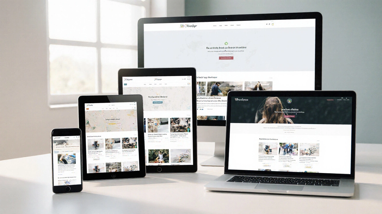
What is responsive web design?
When a site automatically reshapes itself to fit a phone, tablet, laptop, or desktop, that’s Responsive Web Design - a design strategy that combines flexible grids, scalable images, and CSS media queries so content looks good at any viewport size. In plain English, it means your website works everywhere without you having to build separate mobile and desktop versions.
Why use responsive web design? Top 10 reasons
1. Better user experience on every device
Visitors expect sites to load quickly and read easily whether they’re on a 5‑inch phone or a 27‑inch monitor. By adjusting layout, font size, and touch targets, responsive web design keeps bounce rates low and keeps users engaged longer.
2. SEO boost from Google’s mobile‑first indexing
Google now crawls the mobile version of a page first. Sites built with Media Queries - CSS rules that apply different styles based on screen width, orientation, resolution, etc. are indexed as mobile‑friendly, earning higher rankings for relevant queries.
3. Higher conversion rates
Studies from Adobe and HubSpot show that mobile‑optimized pages convert up to 30% better than non‑responsive ones. When checkout forms, CTA buttons, and product grids re‑flow correctly, users can complete actions without zooming or scrolling sideways.
4. Lower maintenance costs
Instead of juggling two separate codebases-one for desktop, another for mobile-you maintain a single set of HTML, CSS, and JavaScript. This reduces duplicate effort, cuts hosting fees, and prevents version drift where one platform gets a feature update while the other lags.
5. Future‑proofing against new devices
New phones with foldable screens, smart TVs, and wearables appear every year. A layout built on Fluid Grids - layout systems that size columns as percentages rather than fixed pixels. automatically adapts, so you won’t need a redesign each time a new screen size hits the market.
6. Faster page load on mobile networks
Responsive sites often serve appropriately sized images via Breakpoints - specific viewport widths where CSS rules change to optimise layout and assets.. Smaller image files mean quicker downloads on 3G/4G, which directly improves Core Web Vitals scores.
7. Improved accessibility
When content re‑flows, screen‑reader users and people with low vision benefit from logical reading order and scalable fonts. Combining Mobile‑First - a design philosophy that starts with the smallest screen and adds complexity for larger viewports. with semantic HTML creates a more inclusive experience.

8. Consistent branding across platforms
A unified look reinforces brand identity. Whether a user lands on your site from a social app, an email newsletter, or a desktop search, the same colors, typography, and imagery appear, building trust and recognition.
9. Higher ad revenue and better monetisation
Responsive ad units resize to fill available space, eliminating blank gaps that occur on non‑responsive pages. Publishers report up to 20% more earnings per thousand impressions because ads stay visible on every screen.
10. Alignment with Google’s Mobile‑First Index
Since 2018, Google evaluates page speed, mobile usability, and structured data on the mobile version first. A responsive site naturally satisfies these criteria, reducing the risk of ranking penalties.
Quick reference table
| Reason | Typical Business Impact | Metric to Track |
|---|---|---|
| Better user experience | Lower bounce rate, longer session time | Bounce rate, Avg. session duration |
| SEO boost | Higher organic traffic | Organic sessions, SERP position |
| Higher conversions | Increased sales or leads | Conversion rate, Goal completions |
| Lower maintenance costs | Reduced developer hours | Hours spent on updates |
| Future‑proofing | Fewer redesign projects | Number of redesign cycles |
| Faster mobile load | Better Core Web Vitals | LCP, FID, CLS scores |
| Improved accessibility | Higher accessibility audit scores | WCAG compliance level |
| Consistent branding | Stronger brand recall | Brand awareness survey results |
| Higher ad revenue | More eCPM from responsive units | Revenue per 1,000 impressions |
| Mobile‑First Index compliance | Fewer ranking penalties | Search Console mobile usability warnings |
Next steps and troubleshooting
- Audit your current site with Google’s Mobile-Friendly Test. Fix any warnings before polishing the responsive layout.
- Start with a mobile‑first wireframe. Define the smallest breakpoint (usually 320px) and add larger breakpoints at 768px, 1024px, and 1440px.
- Use relative units (%, vw, rem) for spacing and typography. Avoid fixed‑pixel widths that break on larger screens.
- Implement
srcsetandsizesattributes on images so browsers serve the right file size for each breakpoint. - Test on real devices, not just emulators. Pay attention to tap targets, navigation menus, and form fields.
Frequently Asked Questions
Do I need a separate mobile site if I use responsive design?
No. Responsive design delivers one URL that adapts to every screen. Separate mobile sites add maintenance overhead and can cause duplicate‑content issues.
What are the most common breakpoints to target?
A typical set includes 320px (small phones), 480px (large phones), 768px (tablets), 1024px (small desktops), and 1440px (large desktops). Adjust based on your audience’s device mix.
Will responsive design slow down my site?
If you serve appropriately sized images and keep CSS/JS bundles lean, performance can actually improve on mobile because smaller files are sent. Use lazy loading and CSS minification to stay fast.
How does responsive design impact SEO beyond mobile‑friendliness?
A single URL consolidates link equity, avoids duplicate content, and lets Google crawl one site structure. Faster page speed and lower bounce rates from a good UI also send positive ranking signals.
Can I use a CSS framework for responsive design?
Yes. Frameworks like Bootstrap, Tailwind, or Foundation provide pre‑built grid systems and breakpoints, speeding up development. Just remember to customise them to avoid unnecessary bloat.