
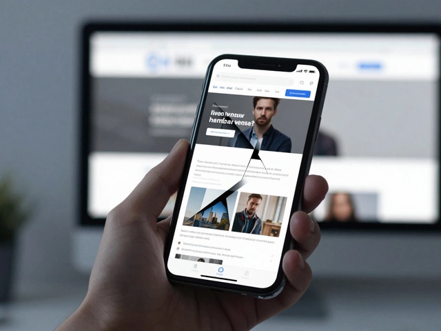
Ever scrolled through a beautifully designed site on your phone, then checked it on your laptop, only to notice it doesn’t feel the same? That’s no accident. Today’s web isn’t just about looking good – it’s about adapting to your device, keeping things smooth whether you’re on a phone, tablet, or desktop. But how do you really know if a website is responsive or adaptive? These terms get thrown around a lot, but they’re not the same thing. The little details say a lot about how a site reacts—and there’s more to it than just shrinking and stretching. If you’ve ever wondered what’s really happening behind the screen (maybe you want to impress your boss, win an argument, or just geek out for fun) you’re in the right place. Let’s get straight into the battle: responsive vs adaptive websites—and how to spot which camp a site falls into with just a few clicks.
What Responsive Web Design Actually Means
Once upon a not-so-distant time, web designers built sites a little like Lego blocks: fixed pieces, everything the same size. Then came the smartphone surge. Any inflexible site looked broken or got cut off. Enter responsive design. At its core, a responsive website doesn’t just shrink or stretch—it actually reflows and rearranges its content depending on your screen. It's like water in a glass: pour it into a cup or a jug, and it changes shape to fit, not just size. This magic happens thanks to flexible grids, fluid images, and especially something called CSS media queries. Designers use these media queries to tell the site, “Hey, if this browser window is less than 700px wide, move this menu down here, stack these photos, make the font a bit bigger.”
To the regular eye, you can spot a responsive site because everything always feels ‘just right’—margins fit, text is readable, buttons are big enough to tap, images don’t awkwardly overflow, and there aren’t any horizontal scroll bars. Want a quick check? Open your laptop, visit a site, and drag your browser window smaller and smaller. If the columns collapse, text wraps properly, and nothing feels squished or lost, congrats, that’s responsive design at work. Even navigation menus often morph; maybe a horizontal menu turns into a hamburger icon on mobile. Google, Wikipedia, and even your favorite pizza app—most big players went responsive long ago, especially after Google made mobile-friendliness a ranking factor back in 2015.
But there’s something even more clever underneath. Responsive design is device-agnostic. Designers don’t have to know if you’re using the latest iPhone, a 2017 Android, or some weird smart fridge display. The site just plays along. If someone launches a totally new gadget tomorrow, odds are the site will still look perfect. Here’s another thing: lots of e-commerce success stories mention big gains from responsive redesigns, not just to look trendy, but because customers now finish more purchases on phones. That translates into real cash. The best part? Responsive sites rarely need separate codebases for desktop and mobile – one site rules them all.
Getting to Know Adaptive Web Design
If responsive is like water in a glass, adaptive design is more like a Swiss army knife—snap out the blade you need for the job. Instead of fluidly reshaping the layout, adaptive sites detect your device and serve up a specific, pre-designed version. So, if you’re on a desktop, you’ll see one layout, but fire up your phone and you’ll get a different, mobile-optimized version made just for small screens. Sometimes there are three or four distinct layouts—tablet, small tablet, giant desktop, and phone—all living side by side.
Adaptive sites use JavaScript or server-side scripts to sniff out what device you’re using before showing you the page. They might check your browser’s ‘user agent string’ (basically, its digital fingerprint) and respond, “Ah, iPad—serve up the 800x600 version!” This approach is older than responsive, but it still works great for certain projects. Ever visited a site that feels completely re-imagined when you switch between your computer and phone? Maybe some images disappear, whole features are missing, or buttons move to totally new spots. Banks, airlines, and old-school news sites sometimes love adaptive—it gives total control over each version. Netflix is a famous example. Their TV, desktop, and mobile interfaces aren’t just resized clones; each gets its own custom layout and features.
You can catch an adaptive site in the wild by resizing your browser. If nothing happens until you hit a certain width, and then suddenly the layout jumps to a new one (instead of gradually changing), you’re likely looking at adaptive. Sometimes, you’ll even be asked to ‘visit our mobile site’—that’s a dead giveaway. Web developers say building adaptive sites lets them fine-tune every single layout, but it takes more work. They have to keep several designs in sync, and a new device size could force a complete overhaul. Adaptive can also be a lifesaver for legacy sites that can’t be rebuilt from scratch but need to work on modern devices.

Simple Tricks to Tell If a Site Is Responsive or Adaptive
You don’t need to be a tech wizard. Grab your browser, a phone, and a tablet if you have one. Head to any site, and here’s how you can figure out what’s going on, step-by-step:
- Resize Your Browser: On your desktop, open the page and slowly make the window smaller. On a responsive site, content will rearrange smoothly—text wraps, images scale, columns collapse. On an adaptive site, you’ll notice the layout doesn’t budge until, suddenly, it jumps to a totally new setup.
- Check for Hidden Elements: Responsive design tries to keep everything visible, usually stacking or shrinking. Adaptive might hide big images, videos, or entire menus on mobile. If things vanish or menus look completely different, it’s probably adaptive.
- Special Mobile URLs: If you spot a mobile-only web address, like ‘m.example.com’, you’re seeing adaptive. Responsive sites nearly always use the same URL for every device.
- Inspect the Code: Not everyone wants to dive into HTML, but for the curious, right-click the page and select ‘Inspect’. Search for ‘@media’ in the CSS code or the word ‘responsive’. Lots of media queries mean it’s responsive. If you see device-based logic in JavaScript or separate HTML sections labeled for mobile, that’s a clue it’s adaptive.
- Try Different Devices: Grab your phone, tablet, and desktop. If you keep seeing familiar layouts that scale and shift slightly, it’s responsive. If mobile feels like a different world—big tap targets, maybe missing features—it’s adaptive.
- Look Up Tools: Tools like Google’s Mobile-Friendly Test (just plug in the URL) or Chrome’s DevTools device toolbar can show you what the site does on different screens. They’re free, fast, and pretty eye-opening if you like geeky tools.
Keep in mind, some fancy sites blur the lines. You might spot a largely responsive design with a pinch of adaptive tweaks. Facebook’s web version, for example, mostly acts responsive, but for some devices it throws in adaptive elements. There’s no rule that says you have to pick only one; the best sites sometimes mix and match to nail the user experience.
Why Should You Care? Real-World Impact
So, why bother telling whether a site is responsive or adaptive? It’s not just technical trivia. If you work with websites (or plan to), picking the right approach can save you thousands in costs, avoid nasty SEO drops, and keep customers happy. For business owners, a responsive design often means less upkeep—one site for everyone, no headaches when the next big tablet hits the market. But if your users demand highly tailored experiences—like booking flights on an airline site with specific mobile forms—adaptive can give you that polish.
The great 2015 ‘Mobilegeddon’ shook up rankings when Google favored responsive design in search results. Suddenly, sites that didn’t play nice with phones started mysteriously vanishing from page one. Even now, mobile usability is a non-negotiable for SEO. If you want people to find you on Google, getting this right matters more than you think. E-commerce data shows that, for some brands, mobile traffic brings in more sales than desktop. If your site fumbles on phones, you’re losing real money, not just bragging rights.
From a developer’s side, keeping everything under one roof (with responsive design) means updates are simpler, and bugs show up less. That doesn’t mean adaptive is on its last legs. Sometimes, only adaptive can handle ultra-precise UI demands—think of the in-flight entertainment systems or smart TVs. Still, most new sites launch with responsive frameworks like Bootstrap or Foundation, saving you from the “endless device tweak” headache.
On your end, whether you’re hiring a designer or just revamping your blog, now you can ask smarter questions. Want a site that survives for years with less work? Ask for modern responsive design. Need incredibly custom experiences for each device? Hybrid or adaptive might be the secret sauce. Next time you pull out your phone and notice the menu stacking perfectly, you’ll know there’s real engineering making that happen. And if you ever doubt it, one quick browser resize will show you exactly what’s under the hood.