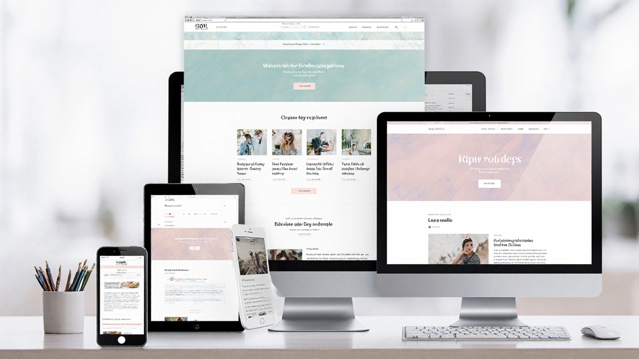
Responsive Design Breakpoint Simulator
Try Different Breakpoints
Adjust the viewport size using the controls below to see how layout changes at different breakpoints.
Responsive Layout Simulator
Visual demonstration of responsive design principles
Sample Responsive Layout
This is a basic responsive layout demonstrating how content adapts to different screen sizes.
Column 1
Column 2
Column 3
Key Takeaways
- Responsive web design ensures a single site works on any device.
- Core techniques are CSS media queries, fluid grids, flexible images, and a mobile‑first mindset.
- Implementing the viewport meta tag is the first step for proper scaling.
- Frameworks like Bootstrap or utilities like Flexbox speed up development.
- Testing on real devices prevents common pitfalls.
Understanding Responsive Web Design
When you hear responsive web design is a design approach that lets web pages adapt smoothly to any screen size, from tiny phones to massive desktop monitors, the idea is simple: the same HTML should work everywhere, while CSS reshapes the layout on the fly.
It started as a reaction to the explosion of smartphones in the early 2010s. Designers realized that static, fixed‑width sites broke on small screens, leading to endless versions of the same page. Responsive web design (RWD) consolidates those versions into one codebase, saving time and keeping the brand consistent.
Core Techniques That Make It Work
Four building blocks form the backbone of any responsive site:
- CSS Media Queries are conditional CSS rules that apply only when certain device characteristics-like width or pixel density-match. They let you change fonts, colors, or layout at specific breakpoints.
- Fluid Grids replace fixed pixel columns with percentages, so columns stretch and shrink proportionally.
- Flexible Images use max‑width: 100% and height: auto so pictures never overflow their containers.
- Mobile‑First Design flips the traditional approach: you write styles for the smallest screens first, then add enhancements for larger viewports.
These techniques work together. For example, a fluid grid defines the overall layout, media queries adjust column counts at breakpoints, and flexible images keep visuals crisp.
Setting Up the Viewport
The first line of code you add to the <head> section is the Viewport Meta Tag. It tells browsers how to scale the page:
<meta name="viewport" content="width=device-width, initial-scale=1">Without this tag, mobile browsers assume a default width of about 980 px, which forces users to pinch‑zoom. The tag makes 1 CSS pixel equal 1 device pixel, allowing media queries to fire at the right sizes.
Step‑by‑Step Implementation
Here’s a practical roadmap you can follow on any project.
- Plan breakpoints. Look at your analytics to see where traffic spikes. Common breakpoints: 480 px (small phones), 768 px (tablets), 1024 px (small laptops), 1440 px (large desktops).
- Define a fluid grid. Start with a container that uses
max-width: 1200px; margin: 0 auto;and split rows into columns with percentages, e.g.,.col‑6 { width: 50%; }. - Add the viewport meta tag. Paste the code from the previous section into
<head>. - Write mobile‑first CSS. Begin with base styles for
0‑479px. Usefont-size: 1rem;and keep the layout single‑column. - Layer in media queries. At each breakpoint, adjust the grid, font sizes, and spacing. Example:
@media (min-width: 768px) { .col‑6 { width: 33.33%; } .hero { height: 400px; } } - Make images flexible. Add
img { max-width: 100%; height: auto; }to your stylesheet. - Test on real devices. Use Chrome DevTools for quick checks, then grab a phone and a tablet to verify touch targets and readability.
Following this checklist keeps the code manageable and ensures you don’t miss any crucial step.
Responsive vs Adaptive: A Quick Comparison
| Aspect | Responsive | Adaptive |
|---|---|---|
| Approach | Fluid layout + media queries | Multiple fixed layouts served based on device |
| Maintenance | Single codebase → easier updates | Separate templates → higher upkeep |
| Performance | Loads one page, CSS decides what to show | May load heavier resources for each device |
| SEO | One URL, consistent ranking signals | Risk of duplicate content if not handled well |
| Best for | Broad audience, fast iteration | Highly specialized apps needing device‑specific UI |
Frameworks & Utilities That Speed Up the Process
While you can hand‑code every rule, many teams rely on proven libraries.
- Bootstrap provides a 12‑column grid, ready‑made breakpoints, and utility classes like
.img-fluidfor flexible images. - Flexbox is a CSS layout mode that aligns items in a single dimension, perfect for navigation bars that wrap on small screens.
- CSS Grid Layout lets you define rows and columns in two dimensions, making complex magazine‑style layouts easier to make responsive.
Pick one based on your project’s complexity. For a simple landing page, Flexbox might be enough. For a dashboard with many widgets, CSS Grid shines.

Common Pitfalls & Pro Tips
Even seasoned developers slip up. Here are the most frequent issues and how to avoid them.
- Hard‑coded widths. Replace
width: 300px;withmax-width: 100%;or percentages. - Neglecting the viewport meta tag. Without it, media queries never fire correctly on mobile.
- Testing only in desktop mode. Emulators are fine, but real‑world testing catches finger‑size tap targets and orientation changes.
- Overusing breakpoints. Stick to three to five logical points; too many cause CSS bloat.
- Ignoring accessibility. Ensure contrast ratios, scalable fonts, and logical focus order stay intact after layout shifts.
Pro tip: Use rem units for typography. They scale with the root font size, which you can adjust per breakpoint for better readability.
Future‑Proofing Your Responsive Site
Device sizes keep evolving. To stay ahead, consider these strategies:
- Adopt container queries (now supported in Chrome and Safari) to let components respond to their own parent size instead of the viewport.
- Leverage CSS clamp() to create fluid typography that never gets too small or too large.
- Keep the design system modular-use token‑based spacing and colors so updates propagate everywhere.
These techniques ensure your site doesn’t need a full rewrite when a new screen size appears.
Frequently Asked Questions
Is responsive web design the same as mobile‑first design?
Mobile‑first is a strategy within responsive design. You start styling for the smallest screens, then add breakpoints for larger devices. All mobile‑first sites are responsive, but not all responsive sites follow a mobile‑first workflow.
Do I need JavaScript for a responsive layout?
No. Pure CSS-media queries, Flexbox, Grid-handles most layout changes. JavaScript can help with more complex interactions, like re‑ordering elements after a breakpoint, but it isn’t required for basic responsiveness.
How many breakpoints should I use?
Three to five is a good rule of thumb: one for phones, one for tablets, one for small desktops, and optionally one for large screens. Too many breakpoints add complexity without real value.
Can I make an existing fixed‑width site responsive?
Yes, but it takes work. Convert pixel‑based widths to percentages, add the viewport tag, replace static images with flexible ones, and create media queries for the major breakpoints you identify.
What tools help with responsive testing?
Chrome DevTools Device Mode, Firefox Responsive Design Mode, and online services like BrowserStack let you preview sites on dozens of devices. Pair them with real‑device testing for the best results.
Does responsive design affect SEO?
Definitely. Google prefers a single URL that serves all devices. This consolidates link equity and avoids duplicate‑content issues that can arise with separate mobile sites.
Next Steps
Pick a small page from your current project, add the viewport meta tag, and rewrite the CSS using percentages and a couple of media queries. Once that page works on a phone without horizontal scrolling, you’ve proven the core concept. From there, expand the approach site‑wide, incorporate a framework if you need speed, and keep testing.
Responsive web design isn’t a one‑time setup; it’s an ongoing habit of thinking in fluid terms. Stick to the checklist above, and your site will look great on any device that comes along.