Responsive Design Breakpoint Calculator
This tool helps you understand common responsive breakpoints and their ideal use cases. Enter your preferred screen width to see matching device categories.
Enter a screen width and click "Find Matching Breakpoint" to see details.
Common Breakpoint Categories
≤ 320px
Ultra-small screens like iPhone SE or older devices
321px - 480px
Modern smartphones in portrait mode
481px - 768px
Tablets in portrait and landscape modes
769px - 1024px
Laptops and small desktops
1025px - 1280px
Standard desktop resolutions
≥ 1280px
Large monitors and ultra-wide displays
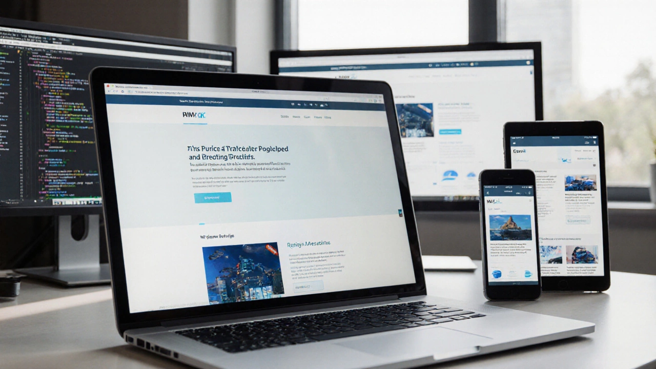
Ever watched a site on your phone and thought, "Wow, this looks squished"? Chances are the page wasn’t built to adapt to different screen sizes. Turning a static site into a responsive web design project doesn’t require a complete rewrite-just a clear plan and a handful of modern techniques. Below you’ll find everything you need to convert any website into a mobile‑friendly experience that works on tablets, laptops, and giant monitors alike.
What is Responsive Web Design?
Responsive Web Design is an approach that makes web pages automatically adjust their layout, images, and typography to fit the viewer’s device. The idea is simple: design once, serve everywhere. Instead of creating separate mobile and desktop versions, you let the browser decide how to present the content based on the available viewport.
Core Building Blocks
Five technical concepts power a fluid, device‑agnostic site. Understanding each one saves you time later.
- CSS Media Queries are conditional CSS rules that apply only when certain screen characteristics (like width or orientation) match. They let you swap layout styles at defined breakpoints.
- Viewport Meta Tag is an HTML tag placed in the that tells mobile browsers how to scale the page initially. Without it, phones assume a fixed 980px width and shrink everything.
- Flexible Grid System is a layout framework using relative units (percentages, fr, or auto) instead of fixed pixels. Grids let columns expand or collapse as the screen grows.
- Flexible Images & Media are visual assets that scale with their container using max-width: 100% and height:auto. This prevents overflow and keeps ratios intact.
- Breakpoints & Fluid Typography are specific screen widths where the layout shifts, often paired with scalable font‑size units like vw or clamp(). They ensure text remains readable on any device.
Step‑by‑Step Process to Make Your Site Responsive
- Set the viewport. Add the following line inside the
<head>of every page:<meta name="viewport" content="width=device-width, initial-scale=1">
This tells browsers to match the viewport width to the device’s screen. - Switch to a fluid grid. Replace fixed
width: 960px;containers with percentage‑based widths. For a three‑column layout, usewidth: 33.33%;or CSS Grid'sgrid-template-columns: repeat(auto-fit, minmax(200px, 1fr));. - Make images flexible. Apply a global rule:
img, picture, video { max-width: 100%; height: auto; }This makes media shrink inside smaller columns while preserving aspect ratios. - Define breakpoints. Choose logical widths based on your design, not arbitrary numbers. Common breakpoints: 320px (small phones), 480px (large phones), 768px (tablets), 1024px (small laptops), 1280px (desktop). Add media queries:
@media (max-width: 768px) { /* tablet styles */ } - Adjust typography. Use
clamp()for fluid font sizes:font-size: clamp(1rem, 2.5vw, 1.5rem);
This keeps headings legible without separate CSS files. - Re‑evaluate navigation. Switch from horizontal menus to a "hamburger" toggle or a collapsible accordion on small screens. CSS Flexbox or JavaScript can hide/show submenus based on screen size.
- Test on real devices. Use Chrome DevTools' device toolbar, Safari's Responsive Design Mode, or physical phones. Verify touch targets are at least 44×44px and text doesn’t need zooming.
- Optimize performance. Large images kill mobile load times. Serve WebP/AVIF versions, enable lazy‑loading (
loading="lazy"), and minify CSS/JS.
Mobile‑First vs Desktop‑First - Which Strategy Wins?
Two philosophies guide when you write your CSS. Mobile‑first starts with a base stylesheet for the smallest screens, then adds features for larger devices. Desktop‑first does the opposite, writing a full‑width layout first and overriding it for mobiles.
| Aspect | Mobile‑First | Desktop‑First |
|---|---|---|
| Initial Load Size | Smaller, because only essential styles load first | Larger, all desktop styles load before overrides |
| Complexity of Media Queries | Mostly min-width queries (add as screen grows) |
Mostly max-width queries (subtract as screen shrinks) |
| Maintainability | Easier to reason about progressive enhancement | Can become tangled as overrides pile up |
| Performance on Mobile | Better, fewer CSS rules applied initially | Potentially slower, more CSS to discard |
| Best For | Projects targeting high mobile traffic or limited bandwidth | Legacy sites where desktop layout is already solid |
For most new projects, mobile‑first wins because it forces you to prioritize core content and keep the code lean.
Testing & Debugging Responsiveness
Even after you think you’re done, hidden bugs often surface on odd screen sizes.
- Browser DevTools. Open the device toolbar, choose "Responsive" and drag the viewport manually to spot layout breakage at any pixel.
- Online validators. Services like responsinator.com or browserstack.com show how your site looks across a range of real devices.
- Accessibility checks. Confirm that focus outlines remain visible after CSS overrides and that tap targets meet the 44px guideline.
- Performance audits. Run Lighthouse or WebPageTest; look for‘large image’ warnings and high‘first contentful paint’ times on mobile.

Common Pitfalls and Pro Tips
Below are mistakes people make when chasing a responsive layout, plus quick fixes.
- Using fixed‑width containers. Replace
width: 1200px;withmax-width: 1200px; width: 100%;. This caps the size but still shrinks on smaller screens. - Forgetting the viewport tag. A missing
meta viewportmakes every phone render a zoomed‑out desktop view, ruining touchability. - Relying on pixel‑based breakpoints. Test content first; break at points where layout actually breaks, not at popular device widths.
- Hard‑coding image dimensions. Use
srcsetandsizesattributes to serve appropriately sized images for each viewport. - Over‑complicating navigation. Simple CSS‑only toggles work for most sites; reserve JavaScript for complex mega‑menus.
- Neglecting hover‑only interactions. On touch devices, replace hover‑only tooltips with click‑or‑focus alternatives.
Quick Checklist Before You Go Live
- Viewport meta tag present on every page.
- All containers use relative widths or max‑width.
- Images, videos, and iframes have
max-width:100%rules. - Media queries cover small (≤480px), medium (≈768px), large (≥1024px) breakpoints.
- Typography scales with
clamp()orvwunits. - Navigation collapses gracefully on mobile.
- Touch targets are at least 44×44px.
- Page passes Lighthouse mobile performance audit (≥90 score).
Frequently Asked Questions
Do I need a separate mobile site after making my site responsive?
No. A true responsive design serves the same HTML to every device and relies on CSS to adapt the layout. Separate mobile URLs add maintenance overhead and can hurt SEO.
What is the best way to choose breakpoints?
Instead of targeting specific devices, design when the layout starts to look cramped. Open your design at various widths and note where columns collapse or text wraps poorly-those are natural breakpoints.
Can I use Flexbox and Grid together?
Absolutely. Flexbox shines for one‑dimensional components like nav bars, while Grid excels at two‑dimensional page layouts. Mixing them gives you maximal flexibility.
How do I serve different image sizes without writing extra CSS?
Use the srcset attribute with width descriptors. The browser picks the best candidate based on viewport width and pixel density, eliminating the need for media‑query‑based image swaps.
Will responsive design hurt my SEO rankings?
On the contrary. Google recommends a single responsive URL because it consolidates link equity and avoids duplicate content issues. Just keep page speed high and you’ll be fine.