Ever opened a website on your phone and saw a tiny desktop page that forced you to pinch‑zoom? That’s a missed chance. Responsive design automatically reshapes a site so it looks good on phones, tablets, and desktops. Google also likes it, so you get better rankings when you go responsive.
First, think fluid grids. Instead of fixed pixel widths, use percentages so elements stretch or shrink with the screen. Next, apply breakpoints in your CSS – those are the widths where the layout changes, like switching from a three‑column grid to a single column. Finally, make images flexible. The max-width:100% rule lets pictures shrink inside their containers, preventing overflow.
Start with a mobile‑first approach. Write the CSS for small screens first, then add media queries for larger devices. Test frequently; the browser’s developer tools let you toggle device sizes in seconds. Pay attention to touch targets – buttons should be at least 44 px tall so fingers don’t miss them.
Don’t forget navigation. A simple hamburger menu works well on phones, but ensure it’s easy to open and close. If you have a lot of content, consider accordion sections that expand on tap. This keeps the page tidy and speeds up loading.
Speed matters especially on mobile networks. Compress images, enable lazy loading, and turn on gzip compression on the server. A fast site feels smoother and reduces bounce rates.
SEO benefits are real. Google’s mobile‑first indexing means the mobile version of your page is the primary source for ranking. Use proper heading hierarchy, keep meta tags consistent, and avoid hidden content that only appears on desktop.
If you’re using a CMS like WordPress, many themes already include responsive grids. Just pick a reputable theme and double‑check its mobile preview. For custom builds, frameworks like Bootstrap or Tailwind give you ready‑made responsive utilities.
Finally, keep an eye on analytics. Look at the “Devices” report in Google Analytics to see how many visitors are on phones versus desktops. If mobile traffic is high, prioritize fixing any layout glitches you spot.
Responsive design isn’t a one‑time task; it’s an ongoing habit. As new devices emerge, revisit your breakpoints and test new screen sizes. Stay simple, keep the user in mind, and your site will look great everywhere.
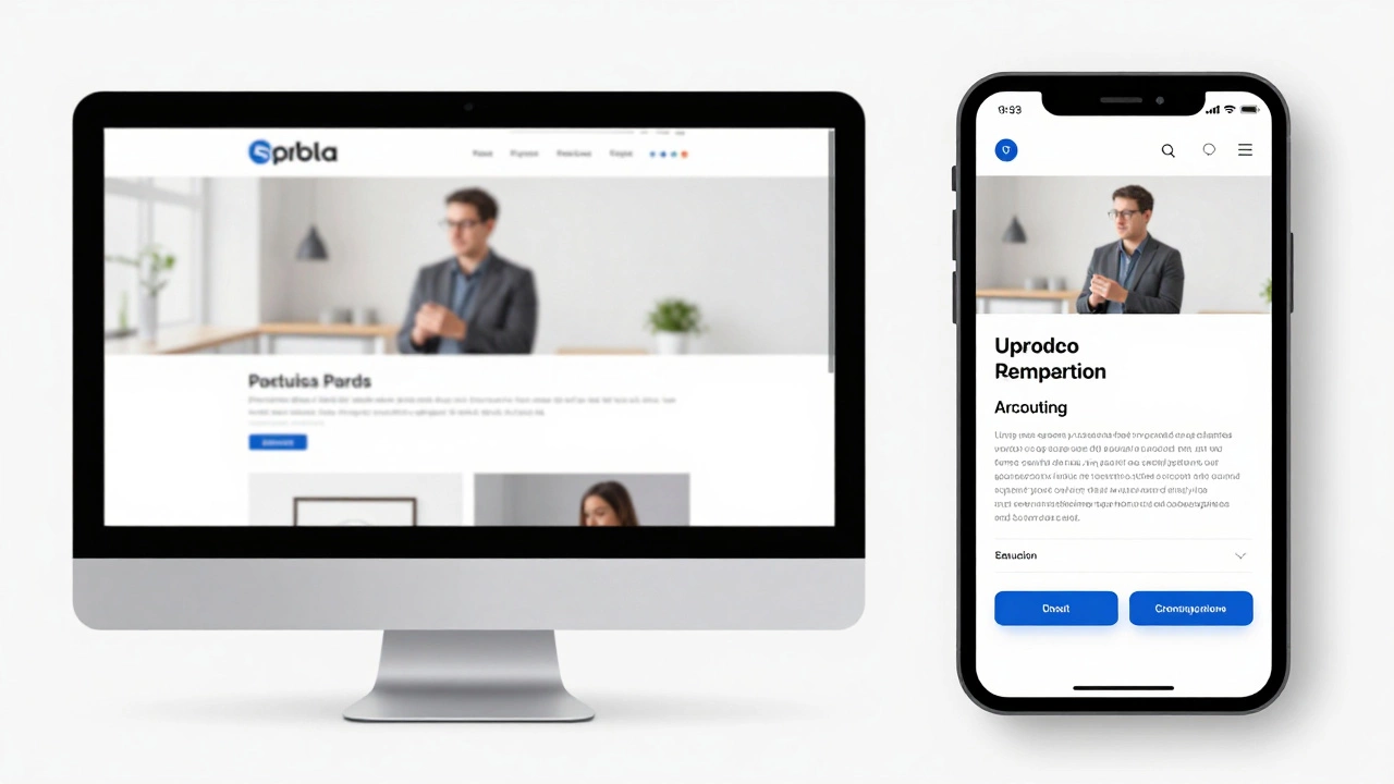
Responsive design ensures websites work seamlessly across all devices - from phones to desktops. It's not optional anymore. Learn how fluid grids, media queries, and mobile-first thinking create better user experiences and boost SEO.
Read More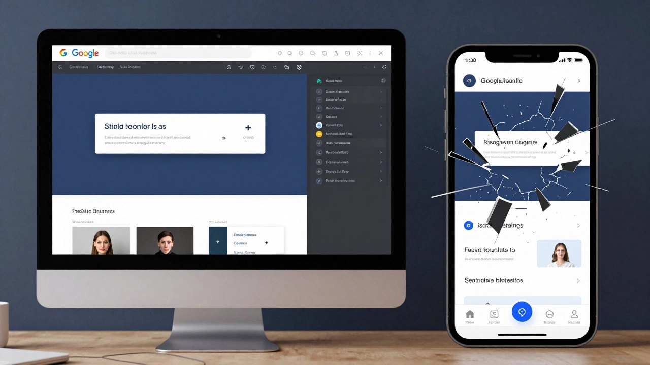
Google Web Designer doesn't automatically make ads responsive-you have to build it in. Learn how to create mobile-friendly HTML5 banners with breakpoints, optimized images, and real device testing.
Read More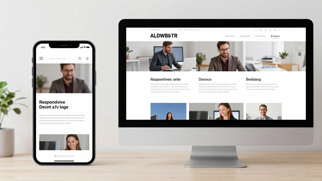
Responsive websites adjust layout for screen size; dynamic websites change content based on user or context. Learn how they differ and which one your project needs.
Read More
Curious about website responsiveness? Learn how to spot if a site is responsive or adaptive, with simple tricks and expert insights. Perfect for anyone wanting clear answers.
Read More
Explore what truly defines responsive design in 2025, why it matters, how it works, and how you can make your website more user-friendly for every device.
Read More
A responsive website adapts seamlessly across various devices and screen sizes, which is crucial in today's diverse tech landscape. This article delves into the importance of having a responsive design, explains simple methods to test a website's responsiveness, and highlights useful tools that facilitate these checks. Understanding the signs of a responsive site ensures your audience gets the best user experience. With these insights, web developers and site owners can ensure their content remains accessible and engaging for every visitor.
Read More
Transforming an existing website into a responsive one involves adapting its layout and functionality to offer an optimized experience across different devices and screen sizes. This process includes examining the site's current structure, applying flexible grids, utilizing media queries, and ensuring touch-friendly interfaces. Emphasizing a mobile-first approach can lead to a more user-centered design, increasing visitor engagement and retention. The right tools and strategies are crucial for successfully transitioning your website into a fully responsive one.
Read More
Responsive design styles have transformed the digital landscape by allowing web designs to adjust seamlessly to various screen sizes. This approach ensures enhanced user experiences across devices, from desktops to smartphones. The article dives into key aspects of responsive design, offering insights into popular techniques and important considerations for designers. Tips on optimizing content and choosing the right frameworks are also discussed.
Read More