Responsive Design Breakpoint Calculator
Optimal Breakpoint Calculator
Determine ideal breakpoint points for your responsive design based on content structure and user behavior.
Responsive Layout
This content will adapt based on screen size.
Column 1
This column is responsive
Column 2
This column is responsive
Think about the last time you visited a website on your phone. Did the buttons shrink until you couldn’t tap them? Did text spill off the screen or require endless horizontal scrolling? That’s not just annoying - it’s a broken experience. Responsive design fixes that. It’s not a trend. It’s the baseline for every website built today.
What exactly is responsive design?
Responsive design is the practice of building websites that automatically adjust their layout, images, and content to fit any screen size - whether it’s a 27-inch desktop monitor, a tablet, or a smartphone. It’s not about creating separate versions of a site for each device. It’s about one site that works everywhere.
Before responsive design, developers built fixed-width layouts. A site might look perfect on a 1920px monitor, but on a 320px phone, it turned into a mess. Users had to pinch, zoom, and scroll sideways just to read a paragraph. That’s why, in 2010, Ethan Marcotte introduced the term responsive web design. He combined three key techniques: fluid grids, flexible images, and CSS media queries. Those are still the backbone of responsive design today.
How does responsive design actually work?
It starts with the viewport. Every modern browser uses a virtual window called the viewport to render web pages. On mobile, this viewport is often narrower than the actual screen - usually around 320 to 414 pixels wide. Without responsive design, a site designed for desktops gets squeezed into that tiny space.
Here’s how it works step by step:
- Fluid grids: Instead of setting widths in pixels (like 960px), you use percentages or CSS units like
frorclamp(). A column that’s 50% wide will always take up half the screen, no matter the size. - Flexible images: Images are set to scale down with their container using
max-width: 100%. This prevents them from overflowing or breaking the layout. - CSS media queries: These let you apply different styles based on screen size. For example, you can stack columns vertically on mobile but display them side-by-side on desktop.
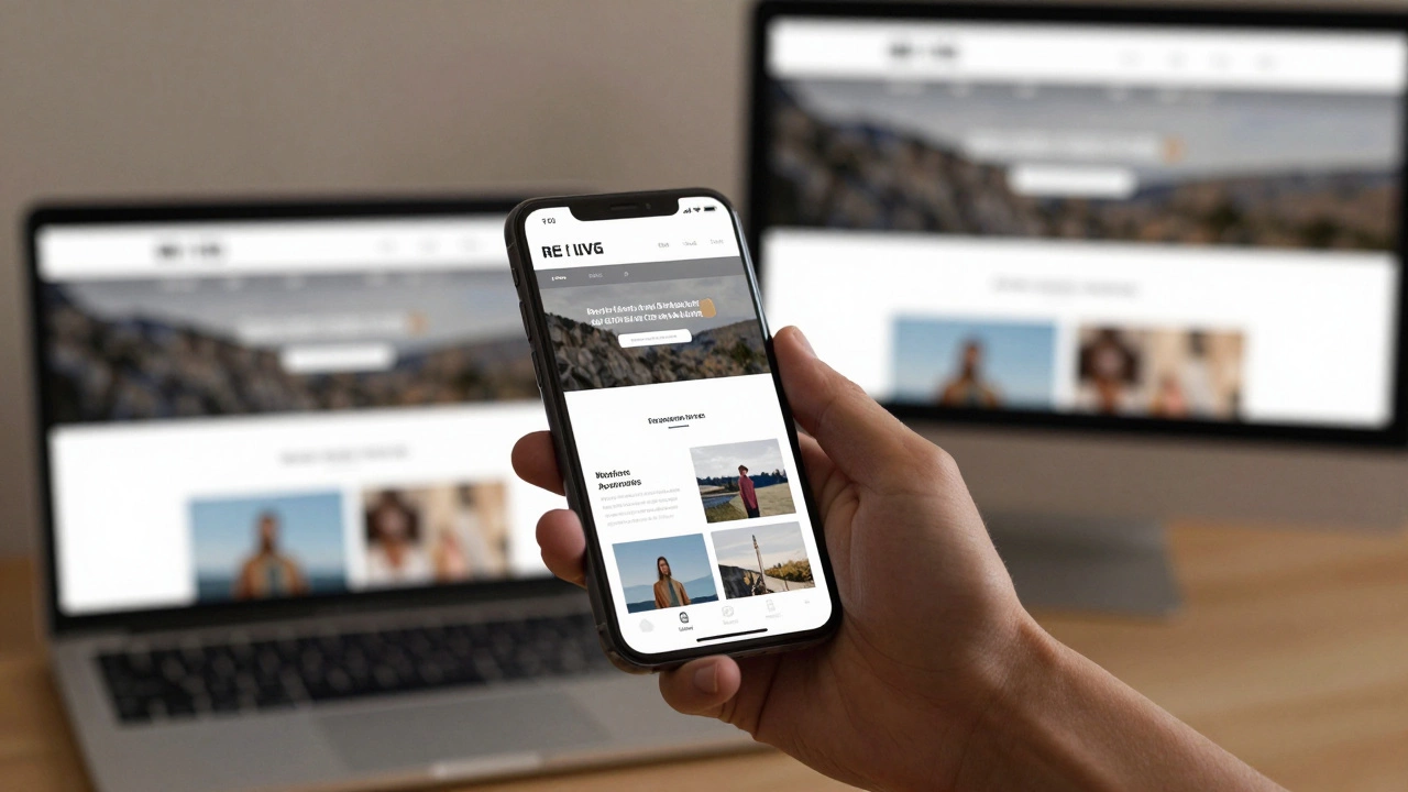
Here’s a real example. On a desktop, a product page might show a large image on the left and details on the right. On mobile, the image moves to the top, and the details stack below it. The same HTML. The same content. Just rearranged for usability.
Why does responsive design matter for UI/UX?
It’s not just about making things look good. It’s about making them usable.
Google stopped supporting non-responsive sites in mobile search rankings back in 2015. Since then, over 60% of global web traffic comes from mobile devices. If your site doesn’t work well on a phone, you’re losing visitors - and sales.
UX suffers when users can’t tap buttons, read text, or navigate menus. Responsive design solves this by:
- Increasing touch target sizes so fingers can tap easily
- Reducing clutter so users aren’t overwhelmed
- Reordering content to match how people scan on mobile (top to bottom, not left to right)
- Improving load times by serving optimized images for smaller screens
A study by Akamai found that 70% of consumers say page speed affects their willingness to buy. Responsive design isn’t just about layout - it’s about performance, too.
Common mistakes in responsive design
Even experienced designers mess this up. Here are the top three errors:
- Ignoring mobile-first: Designing for desktop first, then shrinking down, leads to bloated code and poor mobile experiences. Start with the smallest screen, then scale up.
- Using fixed widths: Setting a container to
width: 960pxbreaks on tablets and phones. Always use relative units. - Overloading mobile with desktop content: Hiding content with CSS instead of removing it from the HTML adds unnecessary load time. If it’s not needed on mobile, don’t send it.
Another mistake? Using too many breakpoints. You don’t need one for every device. Three to five breakpoints (mobile, tablet, small desktop, large desktop, extra-large) are usually enough. Focus on content, not device names.
Tools and frameworks that help
You don’t need to build responsive layouts from scratch. Popular tools handle the heavy lifting:
- CSS Flexbox: Makes it easy to arrange items in rows or columns that adjust dynamically.
- CSS Grid: Lets you create complex two-dimensional layouts that reorganize based on screen size.
- Bootstrap: A widely-used framework with pre-built responsive components like navigation bars, cards, and modals.
- Tailwind CSS: A utility-first framework that lets you apply responsive styles directly in HTML using classes like
md:flexorlg:hidden.
These tools don’t replace understanding - they enhance it. If you don’t know how media queries work, using Bootstrap won’t save you when your layout breaks on an older Android phone.

Testing responsive designs
Never assume it works. Test it.
Browser dev tools have responsive modes, but they’re not enough. Test on real devices. Borrow a friend’s old iPhone. Try it on a tablet at a coffee shop. Use tools like BrowserStack or LambdaTest to check across dozens of devices and browsers.
Also test performance. A responsive site with 5MB of images isn’t responsive - it’s just a slow site on a small screen. Use tools like Lighthouse (built into Chrome DevTools) to audit load times, image sizes, and render-blocking resources.
The future of responsive design
Responsive design isn’t going away. But it’s evolving. New CSS features like container queries, aspect-ratio, and clamp() make it easier than ever to build layouts that adapt to context - not just screen size.
Container queries let a component change its layout based on the space available inside its parent - not the whole viewport. This is huge for reusable components. A card might look one way in a sidebar and another way in a full-width hero section.
And with foldable phones, tablets, and smart TVs all accessing websites, the idea of “one size fits all” is becoming outdated. Responsive design is now about context-aware design - adapting to user behavior, input method (touch vs. mouse), and even network speed.
Final thought: Responsive isn’t optional
If you’re building a website today, responsive design isn’t a bonus feature. It’s the minimum requirement. Users don’t care if you used CSS Grid or Flexbox. They care if they can read your content, tap your buttons, and get what they need in under three seconds.
Responsive design isn’t about code. It’s about respect. Respect for the user’s device. Respect for their time. Respect for their attention.
Is responsive design the same as mobile-friendly design?
No. Mobile-friendly usually means a separate mobile site (like m.example.com) or a simplified version. Responsive design uses one codebase that adapts fluidly across all devices. Google recommends responsive design over separate mobile sites because it’s easier to maintain and provides a consistent experience.
Do I need to design for every screen size?
No. You design for breakpoints - key screen sizes where the layout changes. Most sites use 3-5 breakpoints: below 480px (mobile), 768px (tablet), 1024px (small desktop), 1200px (desktop), and 1440px+ (large screens). Focus on how content behaves, not specific devices.
Can I make an old website responsive without rebuilding it?
It’s possible, but often not worth it. Legacy sites built with tables, fixed widths, or outdated frameworks usually need a major rewrite. The cost of patching old code often exceeds the cost of rebuilding with modern responsive principles. If your site is more than 5 years old, a rebuild is usually the better long-term choice.
Does responsive design affect SEO?
Yes, significantly. Google uses mobile-first indexing, meaning it primarily uses the mobile version of your site for ranking. A non-responsive site will rank lower because it provides a poor mobile experience. Responsive design is now a core ranking factor.
What’s the difference between responsive and adaptive design?
Responsive design uses fluid layouts that adjust continuously. Adaptive design uses fixed layouts at specific breakpoints - like switching between 3 or 4 preset layouts. Responsive is more flexible and easier to maintain. Adaptive can be faster for specific devices but harder to scale. Most modern sites use responsive, not adaptive.