Ever opened a site on your phone and had to pinch‑zoom or scroll sideways? That’s a sign the design isn’t responsive. Responsive web design makes a page automatically adjust to the screen size, so users get a smooth experience no matter what device they use.
First, use fluid grids instead of fixed pixel widths. When you set widths in percentages, the layout stretches or shrinks with the browser window. Second, add breakpoints in your CSS. Breakpoints are the widths where you change the layout – for example, a two‑column layout on desktop might become a single column on a tablet. Third, make images flexible. The max-width:100% rule lets pictures shrink inside their containers without breaking the design.
Responsive isn’t the same as adaptive. Adaptive sites load separate templates for different devices, while responsive sites use one code base that reshapes itself. Responsive is usually faster to maintain because you only update one set of files.
1. **Start with mobile‑first** – write CSS for the smallest screens first, then add styles for larger screens. This keeps the code clean and avoids unnecessary overrides.
2. **Use a viewport meta tag** – <meta name="viewport" content="width=device-width, initial-scale=1"> tells mobile browsers to treat the page width as the device width, preventing the default zoom‑out view.
3. **Test on real devices** – Browser tools are handy, but they can miss quirks. Grab a phone, a tablet, and a laptop, and check that navigation, buttons, and forms are easy to use everywhere.
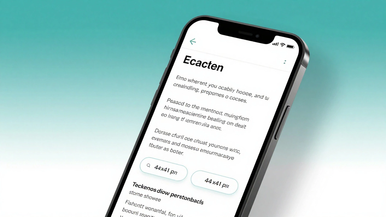
4. **Keep navigation simple** – A burger menu or a collapsible accordion works well on small screens. Make sure the touch targets are at least 44 × 44 px so fingers don’t miss.
5. **Watch load time** – Large images and heavy scripts slow down mobile users. Use responsive image techniques like srcset and compress assets.
Following these steps will give you a site that feels native on any device. If you need a quick way to see if a page is truly responsive, resize your browser window and watch the layout shift. When everything stays readable and usable, you’ve nailed responsive design.
Responsive web design isn’t a trend; it’s a baseline expectation. By using fluid grids, smart breakpoints, and mobile‑first CSS, you can create pages that work everywhere without juggling multiple codebases.
Learn how to make your website truly responsive in 2026 with practical steps: viewport tag, fluid layouts, mobile-first CSS, touch targets, and image optimization. No fluff, just what works.
Read More
Responsive web design lets sites adapt to any screen size. Learn core techniques, step‑by‑step setup, common pitfalls, and FAQs to build fluid, mobile‑first experiences.
Read More
Learn how to transform any website into a responsive, mobile-friendly design with step-by-step instructions, essential tools, and a quick checklist.
Read More
Discover the top 10 reasons why responsive web design is essential, from boosting SEO and conversions to cutting maintenance costs and future‑proofing your site.
Read More
Creating an HTML website that seamlessly adapts to any device ensures optimal user experience and accessibility. This guide delves into effective strategies for achieving cross-device compatibility in web design. Learn how to utilize flexible layouts, implement media queries, and optimize images for responsiveness. Discover essential tips and common pitfalls to avoid when crafting a versatile and dynamic website.
Read More
Creating a responsive website is vital for delivering a seamless user experience across all devices. This guide explores the essential elements of responsive web design, focusing on flexible layouts, media queries, and performance optimization. Learn how to ensure your site adapts to different screen sizes without compromising functionality. Dive into the world of mobile-friendly navigation and discover best practices for responsive images.
Read More