When working with Fluid Layout, a design approach that uses relative units like percentages so page elements stretch and shrink with the browser window. Also known as fluid grid, it lets content adapt naturally to any screen size without fixed pixel constraints. Fluid layout isn’t a new buzzword; it’s the backbone of Responsive Design, a method that makes layouts adapt to different screen sizes using flexible grids and media queries. The two concepts share the goal of keeping users comfortable, whether they’re on a phone, tablet, or desktop. To make that happen, designers rely on Media Queries, CSS rules that apply styles based on device characteristics like width and orientation and carefully chosen Breakpoints, specific viewport widths where the layout shifts to a new arrangement. Together, these tools create a seamless experience that feels custom‑built for every visitor.
Fluid layout encompasses more than just percentages—it requires a mindset that treats the page as a living canvas. When you pair a fluid grid with modern CSS tools like Flexbox or CSS Grid, you gain fine‑grained control over how elements behave at each breakpoint. For example, a three‑column sidebar can collapse into a single column on narrow screens without breaking the design because the column widths are defined as fractions of the viewport. This approach also influences user experience directly: faster load times, reduced scrolling, and fewer layout shifts boost Core Web Vitals, which search engines reward. Moreover, fluid layout works hand‑in‑hand with responsive design principles, ensuring that typographic scales, image sizes, and interactive components all respond proportionally. By planning breakpoints around common device widths—320 px, 768 px, 1024 px—you create predictable patterns that developers can test quickly, cutting down on debugging time. The result is a site that feels native on any device, improves SEO signals, and requires less maintenance than a rigid, pixel‑based layout.
What you’ll discover in the collection below is a mix of practical guides and strategic insights that cover the whole fluid‑layout ecosystem. From the top 10 benefits of responsive web design to deep dives on CSS techniques, each article shows how to implement fluid grids, set effective breakpoints, and leverage media queries without sacrificing performance. You’ll also see how fluid layout ties into broader topics like SEO for developers, mobile‑first strategies, and the latest trends in web frameworks. Whether you’re a beginner looking for a clear roadmap or an experienced dev wanting to fine‑tune your approach, the posts ahead give you actionable steps, real‑world examples, and the why behind every recommendation. Dive in and start building websites that flex, adapt, and stay ahead of the curve.
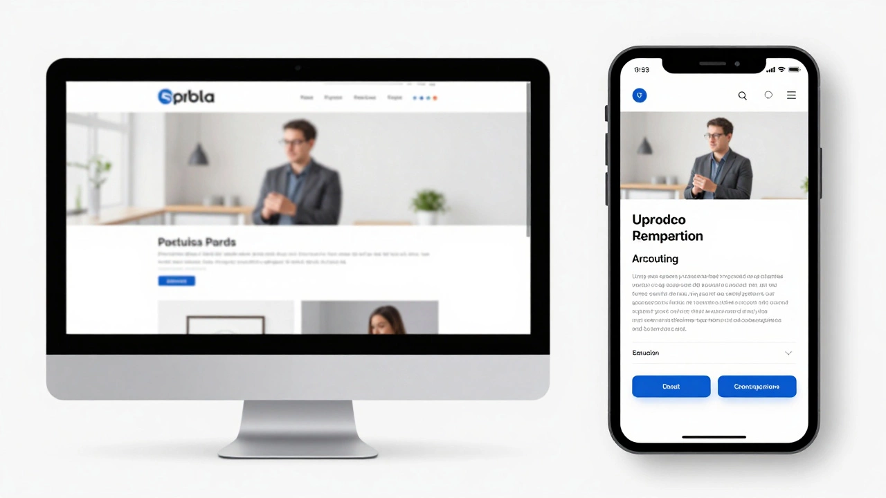
Responsive design ensures websites work seamlessly across all devices - from phones to desktops. It's not optional anymore. Learn how fluid grids, media queries, and mobile-first thinking create better user experiences and boost SEO.
Read More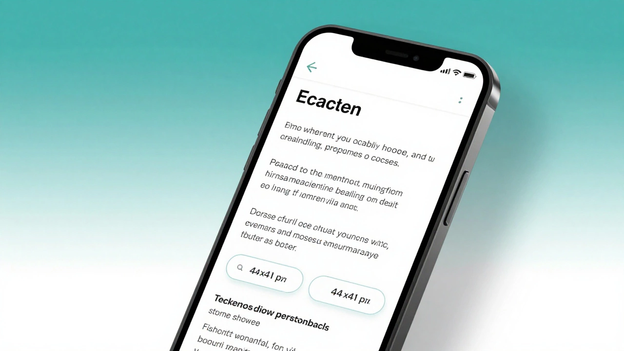
Learn how to make your website truly responsive in 2026 with practical steps: viewport tag, fluid layouts, mobile-first CSS, touch targets, and image optimization. No fluff, just what works.
Read More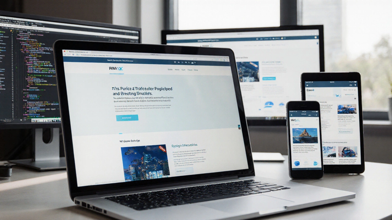
Learn how to transform any website into a responsive, mobile-friendly design with step-by-step instructions, essential tools, and a quick checklist.
Read More