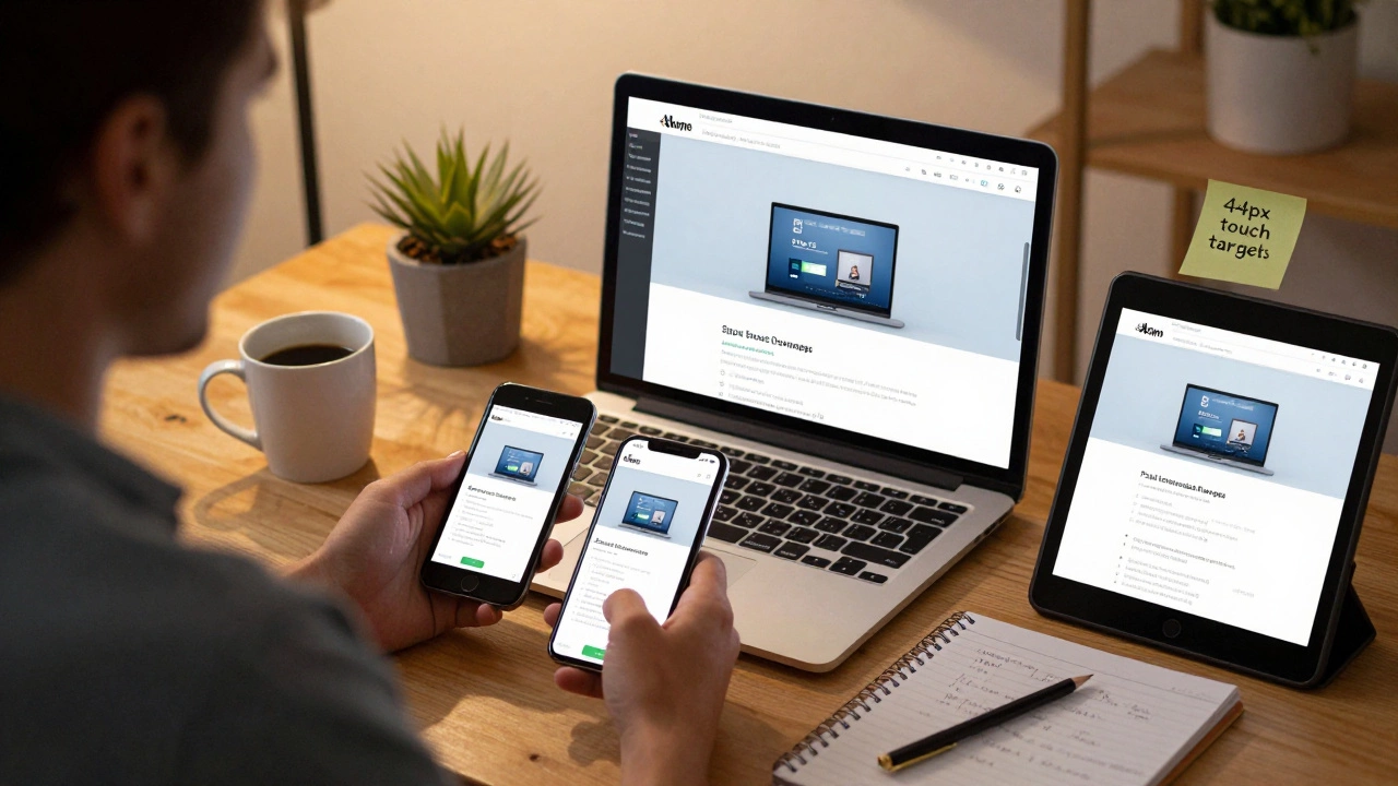
Responsive Touch Target Checker
The article emphasizes that interactive elements need to be at least 44x44 pixels for proper mobile usability. Check your button or link dimensions to ensure they meet this requirement.
Over half of all web traffic now comes from mobile devices. If your website doesn’t work well on a phone, you’re losing visitors - and sales - every single day. Making your website responsive isn’t optional anymore. It’s the baseline for any site that wants to be seen, used, and trusted.
Start with the viewport meta tag
The first thing you need to check is the viewport meta tag. Without it, your site will look like a desktop version squeezed onto a small screen. Most browsers assume you want to show the full desktop layout, even on phones. That means text becomes tiny, buttons are hard to tap, and users have to pinch and zoom just to read a paragraph.
Add this line inside the <head> section of your HTML:
<meta name="viewport" content="width=device-width, initial-scale=1.0">This tells the browser: "Use the actual width of the device, and don’t zoom out to fit a desktop layout." It’s the most basic step - and the one most sites forget. If you skip this, nothing else you do will fully fix the problem.
Use fluid layouts, not fixed widths
Stop using pixels for widths. If you set a container to width: 960px;, it will break on any screen smaller than that. Instead, use percentages, max-width, or CSS Grid and Flexbox.
For example:
.container {
  width: 100%;
  max-width: 1200px;
  margin: 0 auto;
}
This means the container will stretch to fill the screen, but never get wider than 1200 pixels. On a phone, it’ll be 100% wide. On a desktop, it’ll max out at 1200px. No horizontal scrolling. No broken layouts.
Same goes for images. Use:
img {
  max-width: 100%;
  height: auto;
}
This ensures images scale down with their container. No more images spilling over the edge or getting cut off.
Build with mobile-first CSS
Don’t design for desktop first, then shrink it down. Start with how your site looks on a phone. Then, use media queries to add styles for larger screens.
Here’s how:
/* Default styles for mobile (smallest screen) */
.nav-menu {
  display: block;
}

/* Tablet and up */
@media (min-width: 768px) {
  .nav-menu {
    display: flex;
    justify-content: space-around;
  }
}

/* Desktop and up */
@media (min-width: 1024px) {
  .nav-menu {
    justify-content: flex-end;
  }
}
This approach is cleaner, faster, and more maintainable. You’re not overriding desktop styles for mobile - you’re building up from a working base. It also means your site loads faster on mobile because you’re not sending desktop CSS to phones.
Test on real devices - not just browser tools
Chrome DevTools are great, but they’re not perfect. They can’t replicate real-world conditions like slow networks, touch input delays, or how different phones render fonts.
Here’s what to do:
- Use your own phone. Open your site in Safari (iOS) or Chrome (Android).
- Ask a friend to open it on their device - different screen sizes, different browsers.
- Test in landscape and portrait mode.
- Check form fields: Can users tap them easily? Do keyboards cover up buttons?
- Try loading it on 3G speed. Use Chrome DevTools’ Network tab to throttle to "Slow 3G".
One client I worked with thought their site was fine - until they tested it on an older iPhone 7. The buttons were so small, users kept tapping the wrong one. That was a 40% drop in form submissions. Fixing it took two hours. Losing those sales cost them thousands.
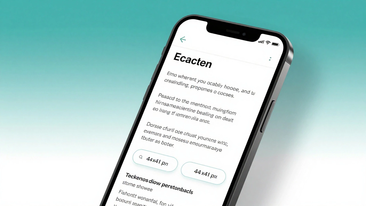
Touch targets need to be big enough
People don’t use mice on phones. They use fingers. Fingers are thick. If your buttons or links are smaller than 44x44 pixels, they’re too hard to tap accurately.
Make sure:
- Buttons are at least 44px tall and wide
- Links have enough spacing around them (at least 8px padding)
- Navigation menus don’t have tiny, crowded icons
Use this CSS to help:
button, a {
  min-height: 44px;
  min-width: 44px;
  padding: 12px;
}
Even if the visual design looks small, the touch area should be large. This isn’t just usability - it’s accessibility.
Use modern layout tools: Flexbox and Grid
Forget old-school floats and inline-block hacks. Modern responsive design uses Flexbox and CSS Grid.
Flexbox is perfect for one-dimensional layouts: navigation bars, card lists, form fields in a row.
.card-list {
  display: flex;
  flex-wrap: wrap;
  gap: 16px;
}

.card {
  flex: 1 1 300px;
}
This means each card will be at least 300px wide, but shrink or grow to fit the screen. On a phone, they stack vertically. On a desktop, three fit side by side.
CSS Grid is better for two-dimensional layouts: dashboards, product grids, magazine-style pages.
.grid-container {
  display: grid;
  grid-template-columns: repeat(auto-fit, minmax(250px, 1fr));
  gap: 20px;
}
This creates columns that automatically adjust based on screen size. No media queries needed. It’s smart, clean, and works everywhere.
Optimize images for different screens
Don’t serve a 3000px-wide hero image to someone on a phone. It’s slow, wastes data, and hurts performance.
Use the <picture> element with multiple sources:
<picture>
  <source media="(max-width: 767px)" srcset="hero-mobile.jpg">
  <source media="(max-width: 1200px)" srcset="hero-tablet.jpg">
  <img src="hero-desktop.jpg" alt="Hero image">
</picture>
Or use srcset with descriptors:
<img src="image.jpg"
     srcset="image-480w.jpg 480w, image-800w.jpg 800w, image-1200w.jpg 1200w"
     sizes="(max-width: 600px) 100vw, (max-width: 1200px) 50vw, 33vw"
     alt="Responsive image">
These tell the browser: "Pick the right file based on screen size and resolution." It cuts load times by 60% or more on mobile.
Check your typography
Small text on mobile is unreadable. Don’t rely on users zooming in.
Set your base font size with rem, not pixels:
html {
  font-size: 16px;
}

body {
  font-size: 1rem;
}

h1 {
  font-size: 2rem;
}
This lets users adjust their browser’s default font size, and your site respects it. It’s better for accessibility and works with system-wide settings.
Avoid font sizes smaller than 16px for body text. On mobile, anything below that becomes a strain to read. Use line height of at least 1.5 to make paragraphs easier to scan.
Run a quick audit
Before you launch, run these five checks:
- Open your site on your phone. Can you read everything without zooming?
- Tap every button. Do they respond easily? Is there space between them?
- Scroll through the whole page. Does anything break or overlap?
- Check forms: Can you type without the keyboard hiding the submit button?
- Use Google’s Mobile-Friendly Test tool (free, no login needed). It tells you exactly what’s wrong.
If you pass all five, your site is responsive. Not "kind of" - actually responsive.
What not to do
Here are the biggest mistakes people make:
- Using fixed pixel widths for containers
- Ignoring the viewport meta tag
- Using desktop-only navigation (like hover menus)
- Serving the same large images to all devices
- Testing only on desktop browsers
- Assuming "it looks fine on my iPhone" - because your iPhone isn’t everyone’s
One client insisted their site was responsive because it "looked okay" on their iPad. But on Android phones, the footer floated over the content. That’s not responsive - that’s broken.
Final thought: Responsiveness is a habit, not a task
You don’t "make a site responsive" once and forget it. Every new feature, image, or plugin you add could break it. Make responsive design part of your workflow. Test every change on a phone before you commit. Add mobile checks to your code review process. Treat it like you treat security or speed - because it’s just as important.
Responsive design isn’t about fancy animations or trendy layouts. It’s about making sure your website works for the person holding it in their hand - no matter what device they’re using.
What’s the most common mistake when making a website responsive?
The most common mistake is skipping the viewport meta tag. Without it, mobile browsers assume you want to show the full desktop layout, making text tiny and forcing users to pinch and zoom. This one line - <meta name="viewport" content="width=device-width, initial-scale=1.0"> - fixes 80% of basic responsiveness issues.
Do I need to use a framework like Bootstrap?
No. Frameworks like Bootstrap can help speed things up, but they’re not required. Many sites built with plain CSS, Flexbox, and Grid are faster, lighter, and more customizable. If you’re comfortable writing your own responsive rules, skip the framework. Only use one if you’re building something complex and need pre-built components.
How do I test responsiveness without owning every phone?
Use browser DevTools to simulate different screen sizes, but always verify on real devices. Free tools like BrowserStack or LambdaTest let you test on real iOS and Android phones remotely. For quick checks, ask friends to open your site on their phones. Real-world testing beats simulated environments every time.
Why does my site look different on iPhone vs Android?
Different browsers (Safari vs Chrome) and operating systems handle fonts, scrollbars, and touch events slightly differently. Always test on both. Use CSS resets or normalize.css to reduce inconsistencies. Avoid browser-specific hacks - they break over time. Stick to standard CSS properties and test across platforms.
Is responsive design the same as mobile-first design?
Not exactly. Responsive design means your site adapts to any screen size. Mobile-first is a strategy: you start by designing for the smallest screen, then add styles for larger ones. Mobile-first is the best way to achieve responsive design because it forces you to prioritize content and performance. You can be responsive without being mobile-first - but you’ll likely end up with bloated code and slower load times.