


CSS Unit Responsive Visualizer
Settings
Live Preview
Current Calculation:
- Unit: px
- Input Value: 16
- Computed Font Size: 16px
- Relative to Viewport: 2%
You’ve spent hours perfecting your layout on a desktop monitor. It looks crisp. The spacing is balanced. But then you pull it up on an iPhone SE or a tablet in landscape mode, and suddenly your text is either microscopic or overflowing its container. If you’re relying solely on pixels (px) for your responsive design, this is likely why.
The short answer is: no, you should not use only pixels for responsive design. While pixels are still useful for specific structural elements, relying on them exclusively creates rigid layouts that break across different screen sizes and user accessibility settings. Modern web development demands a hybrid approach using relative units like rem, em, and viewport units (vw/vh).
Why Pixels Feel So Tempting
Let’s be honest. Pixels are easy. When you set a width to 300px, you know exactly how big it is. There’s no math involved. No wondering if the parent element changed size. In the early days of the web, when everyone used fixed-width monitors (think 800x600 or 1024x768), pixels were the standard because they offered precise control over layout.
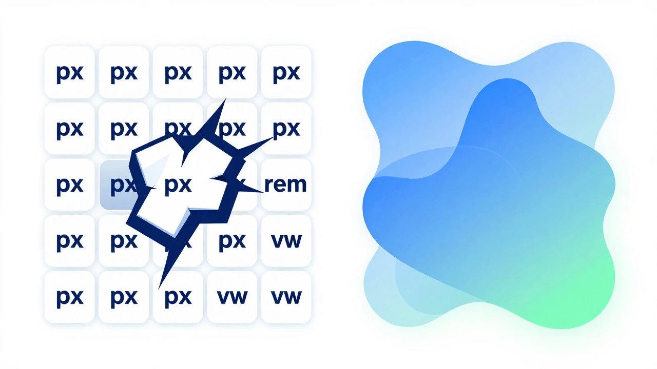
Even today, many developers default to pixels out of habit. Design tools like Figma often export measurements in pixels, which reinforces the idea that px is the native language of the browser. However, the web has evolved. We now have devices with varying pixel densities (Retina displays, high-DPI Android phones) and users who rely on browser zoom or custom font sizes for accessibility. Fixed pixels ignore all of these variables.
Are pixels bad for accessibility?
Yes, relying heavily on pixels can hurt accessibility. Users with visual impairments often increase their browser's default font size or use zoom features. Text sized in pixels does not always scale correctly with these settings, forcing users to zoom in manually, which breaks the layout flow. Relative units like rem respect the user's system preferences, making your site more inclusive.
The Problem with Fixed Pixels in a Fluid World
Responsive design is about adaptability. It’s about creating interfaces that reshape themselves based on the available space. Pixels are absolute units. A 100px button is 100px wide whether it’s on a 4K monitor or a smartwatch. This rigidity causes two major issues:
- Horizontal Scrolling: If you set a container to
1200pxwide, any device smaller than that will force the user to scroll horizontally. This is a cardinal sin in mobile UX. - Inconsistent Typography: Setting body text to
16pxmight look fine on your laptop, but on a phone held at arm’s length, it could feel too small. Conversely, on a large TV screen, it might look tiny.
Browsers interpret CSS pixels differently than physical screen pixels due to Device Pixel Ratio (DPR). A CSS pixel is an abstract unit that remains consistent visually, but it doesn’t automatically adjust for readability context. That’s where relative units shine.
The Better Alternative: REM and EM Units
If you want your design to breathe and adapt, switch to rem (root em) and em. These units are relative to the font size of the root element (for rem) or the parent element (for em). By default, most browsers set the root font size to 16px. Therefore, 1rem equals 16px.
Here’s why rem is superior for typography and spacing:
- Accessibility Compliance: If a user sets their browser’s default font size to
20px, all yourrem-based text scales up proportionally. Your layout adjusts automatically without breaking. - Predictable Scaling: Unlike
em, which compounds as you nest elements (leading to unexpectedly huge or tiny text),remalways references the root. This makes debugging easier. - Design System Consistency: Most modern design systems use a scale based on
rem. For example, a heading might be2.5remand a paragraph1rem. This keeps vertical rhythm intact.
For margins, padding, and borders, rem is also the go-to. It ensures that whitespace scales with text, maintaining visual balance regardless of the user’s zoom level.
When Viewport Units (VW/VH) Make Sense
Sometimes, you need elements to fill the screen or scale dramatically with the window size. This is where viewport units come in. vw is 1% of the viewport width, and vh is 1% of the viewport height.
Viewport units are powerful for hero sections, full-screen backgrounds, or fluid typography. For instance, setting a hero title to font-size: 10vw; means it will take up 10% of the screen width. On a wide monitor, it’s huge; on a phone, it shrinks down. This creates a truly fluid experience.
However, use them cautiously. Pure viewport-based text can become unreadable at extreme widths. A common best practice is to clamp viewport units between a minimum and maximum value using the clamp() function:
font-size: clamp(1rem, 4vw, 3rem);This tells the browser: “Make the font size 4% of the viewport width, but never let it get smaller than 1rem or larger than 3rem.” This combines the fluidity of vw with the safety nets of rem.
Where Pixels Still Have a Place
Does this mean you should delete every px from your codebase? Not necessarily. Pixels still serve specific, valuable purposes in responsive design:
- Thin Borders and Dividers: A
1px border is universally understood as a hairline separator. Using0.0625remachieves the same result but is harder to read and maintain. Stick to1pxfor borders. - Box Shadows: Subtle shadows often look best defined in pixels. A shadow spread of
2pxis precise and predictable. - Icon Sizes: Small icons (like those from FontAwesome or Material Icons) are often designed at specific pixel dimensions. Keeping them in
pxensures they don’t distort when scaled viaemorremif the parent font size changes unexpectedly. - Media Query Breakpoints: You define breakpoints in pixels (e.g.,
@media (min-width: 768px)). This is correct because you’re measuring the physical width of the viewport, not scaling content relative to it.
Comparison: PX vs. REM vs. VW
| Unit | Relative To | Best Use Case | Accessibility Impact |
|---|---|---|---|
px |
Screen pixel (absolute) | Borders, shadows, media queries | Low (does not scale with user prefs) |
rem |
Root font size | Typography, margins, padding | High (scales with user prefs) |
em |
Parent font size | Component-internal spacing | Medium (can compound unpredictably) |
vw/vh |
Viewport width/height | Hero sections, fluid layouts | Variable (requires clamping) |
Practical Tips for a Hybrid Approach
To build robust, accessible, and responsive websites, adopt a hybrid strategy. Here’s a checklist to guide your CSS decisions:
- Set Root Font Size: Define your base font size in
rem(usually1rem = 16px) on thehtmlelement. This gives you a solid foundation. - Use REM for Spacing: Convert your design system’s spacing scale to
rem. For example, if your grid uses 8px increments, use0.5rem(since 8/16 = 0.5). - Clamp Fluid Values: For headings and key UI elements, use
clamp()withremandvwto ensure they scale smoothly but stay within readable bounds. - Keep Breakpoints in PX: Continue using pixels for your media queries. It’s the industry standard and avoids confusion.
- Avoid Inline Styles: Inline styles often default to pixels. Move styling to external sheets where you can enforce relative units consistently.
By mixing these units, you get the best of both worlds: the precision of pixels for structural details and the flexibility of relative units for content and layout. This approach not only improves the user experience across devices but also future-proofs your site against evolving accessibility standards.
Common Pitfalls to Avoid
Switching from pixels to relative units isn’t just about changing numbers. It requires a shift in mindset. One common mistake is forgetting to reset the browser’s default margin and padding. Browsers apply different defaults, which can throw off your rem calculations. Always include a CSS reset or normalize stylesheet at the start of your project.
Another pitfall is overusing viewport units for text. As mentioned earlier, text that scales infinitely with the viewport becomes unreadable. Always pair vw with min and max constraints. Similarly, avoid nesting em values too deeply. If you have a component inside a section inside a main div, each layer multiplying its font size by 1.2em will result in exponentially larger text. Stick to rem for global consistency and reserve em for component-specific adjustments where scaling relative to the immediate parent is intentional.
Finally, test your designs with actual accessibility tools. Use your browser’s developer tools to simulate low-vision settings or increase the default font size. See how your layout holds up. If elements overlap or text gets cut off, revisit your use of absolute units. The goal is resilience, not just responsiveness.
Conclusion: Embrace Flexibility
Using pixels exclusively for responsive design is a relic of the past. While they still have niche applications, the future of web development lies in relative units. By adopting rem for typography and spacing, and leveraging viewport units for fluid layouts, you create websites that are not only adaptable but also inclusive. Your users will thank you for a seamless experience, whether they’re on a smartphone, a desktop, or using assistive technologies.