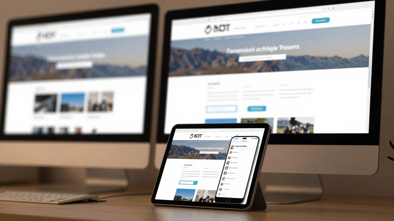
Discover why relying solely on pixels (px) hurts responsive design. Learn how to use rem, em, and viewport units for accessible, flexible layouts that work on all devices.