

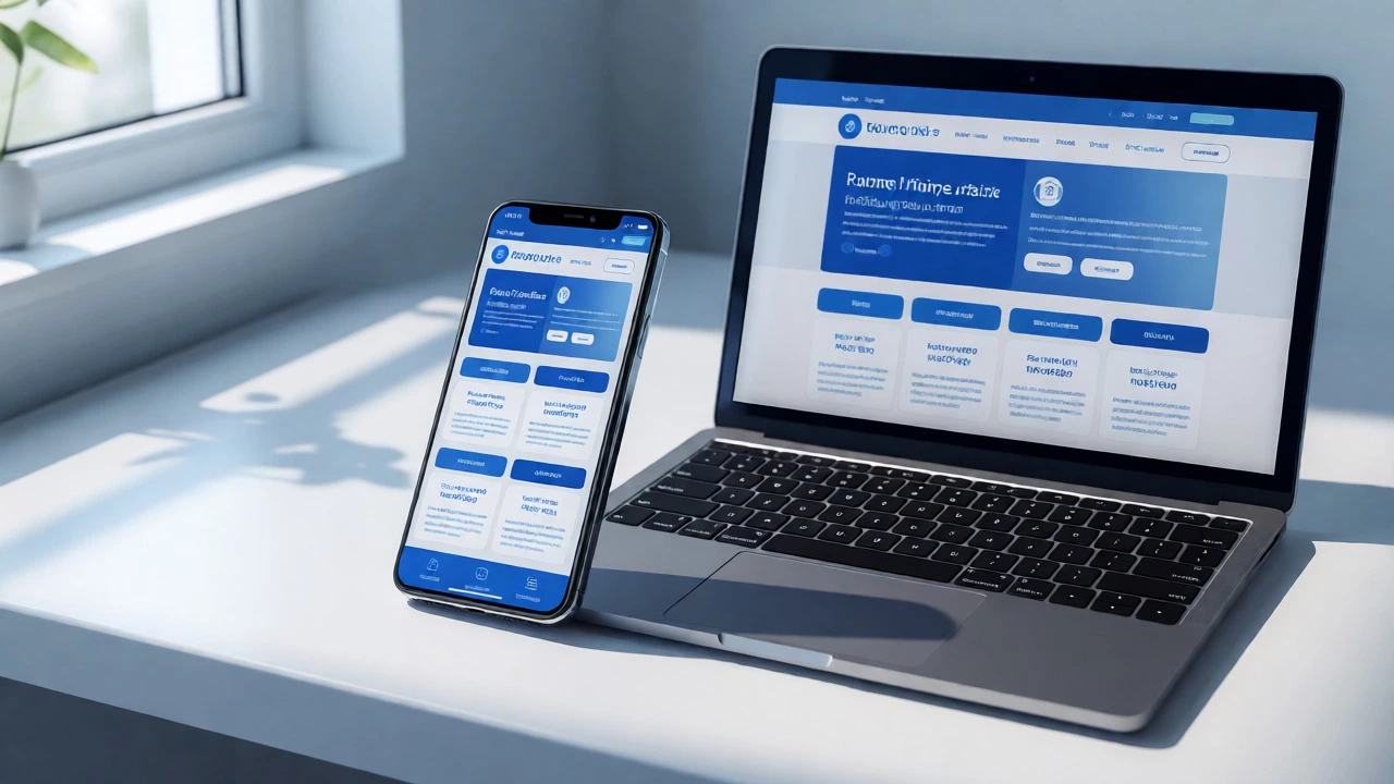
Responsive Web Design Simulator & Quiz
Explore how a single codebase adapts to different devices, then test your understanding of why this approach is critical for modern businesses.
Notice how the layout shifts from side-by-side columns (Desktop) to stacked elements (Mobile).
You’ve probably seen the stats: over 60% of global web traffic now comes from smartphones. If your website looks like a postage stamp on an iPhone or requires horizontal scrolling on a tablet, you’re losing money. But is Responsive Web Design actually good for your business, or is it just another buzzword developers throw around to justify higher invoices?
The short answer is yes, but not for the reasons most people think. It’s not just about making things look pretty. It’s about survival in a search engine landscape that punishes bad mobile experiences and users who have zero patience for broken layouts. Let’s break down why this approach is essential, where it might fall short, and how to implement it without blowing your budget.
What Actually Is Responsive Web Design?
Responsive Web Design (RWD) is a web development approach that creates dynamic changes to the appearance of a website, depending on the screen size and orientation of the device being used to view it. Unlike older methods where you built separate sites for desktop and mobile, RWD uses one set of code that adapts fluidly. Think of water filling a container; the shape changes, but the substance remains the same.
This concept relies on three core technical pillars:
- Fluid Grids: Instead of fixed pixel widths, elements use percentages. A column might take up 50% of the space on a desktop and 100% on a phone.
- Flexible Images: Media assets are scaled within their containing elements so they never overflow the screen boundaries.
- Media Queries: These are CSS rules that apply different styles based on specific conditions, like "if the screen width is less than 768px, stack the navigation bar vertically."
Why Search Engines Love Responsive Sites
If you care about traffic, you need to understand Google’s shift to Mobile-First Indexing. Since 2018, Google has primarily used the mobile version of content for indexing and ranking. This means if your mobile site is slow, clunky, or missing content compared to your desktop version, your rankings suffer across the board.
Here’s the reality check: having two separate websites (one for m-dot domains and one for www) creates duplicate content issues. You end up managing two sets of URLs, two sets of analytics, and double the maintenance work. With responsive design, you have one URL per page. This consolidates link equity. When someone shares your blog post on LinkedIn, all the backlinks point to one place, boosting your authority rather than splitting it between mobile and desktop versions.

The User Experience Argument
Let’s talk about your visitors. Imagine trying to read a dense article on a desktop-sized layout squeezed into a small phone screen. The text is tiny. The buttons are too close together, leading to accidental clicks. This friction causes bounce rates to spike. Studies consistently show that 53% of mobile users abandon sites that take longer than three seconds to load, and poor responsiveness is a major contributor to perceived slowness.
A well-executed responsive design ensures readability and navigability regardless of the device. It respects the user’s context. Someone browsing on a commute wants quick access to contact info or directions. Someone on a desktop might want deep-dive articles. While the content stays the same, the presentation shifts to prioritize what matters most on smaller screens, such as larger tap targets and simplified menus.
Cost and Maintenance Efficiency
From a business perspective, maintaining separate mobile and desktop sites is a nightmare. Every time you update a product description or change a brand color, you have to do it twice. This doubles the risk of human error-imagine updating the price on the desktop site but forgetting the mobile site.
| Feature | Separate Mobile Site (m.dot) | Responsive Web Design |
|---|---|---|
| Development Cost | High (Build & maintain two sites) | Moderate (One build, flexible logic) |
| Maintenance Effort | Double workload | Single source of truth |
| SEO Impact | Risk of duplicate content penalties | Consolidated link equity, better crawl efficiency |
| User Experience | Inconsistent branding across devices | Seamless transition between devices |
| Future Proofing | Poor (New device sizes require updates) | Strong (Adapts to any viewport) |

When Responsive Design Might Not Be Enough
While responsive design is the gold standard, it isn’t magic. It doesn’t fix bad content or poor performance by itself. If you try to force a complex, data-heavy dashboard onto a smartphone using only CSS scaling, you’ll end up with a frustrating user experience. In these cases, you might need Adaptive Web Design, which serves distinct static layouts for specific screen sizes.
Also, be wary of "responsive" templates that are bloated with unnecessary JavaScript libraries. Just because a site shrinks doesn’t mean it loads fast. On slower 4G networks common in rural areas or crowded cities, heavy responsive frameworks can drag down performance. Always test your site on actual low-end Android devices, not just emulators in Chrome DevTools.
How to Implement It Right
Don’t just slap some media queries on an old site. Start with a Mobile-First Strategy. This means designing the smallest screen first, then adding complexity as the screen gets larger. It forces you to prioritize content. What really needs to be there?
- Audit Your Content: Identify what users need on mobile. Usually, it’s contact info, pricing, and core services.
- Choose a Flexible Framework: Tools like Bootstrap or Tailwind CSS provide pre-built grid systems that handle much of the heavy lifting.
- Test Across Devices: Use browser developer tools to simulate various widths, but also physically test on iPhones, iPads, and Android tablets.
- Optimize Images: Use modern formats like WebP and ensure images are sized correctly for each breakpoint to save bandwidth.
Does responsive web design affect my SEO ranking?
Yes, significantly. Google prioritizes mobile-friendly sites in its search results due to mobile-first indexing. A non-responsive site may rank lower, especially for searches performed on mobile devices, potentially reducing organic traffic by 20-30%.
Is responsive design more expensive than building a separate mobile app?
Generally, yes, it is cheaper to maintain than a native mobile app. However, initial development can be slightly more complex than a basic static site because of the need for flexible grids and testing. Over time, the single-codebase advantage saves money compared to maintaining both a web and app ecosystem.
Can I make my existing WordPress site responsive?
Most modern WordPress themes are already responsive. If yours isn't, you can often switch to a responsive theme or add custom CSS media queries. However, heavily customized legacy themes might require significant redevelopment to become truly responsive.
What is the difference between responsive and adaptive design?
Responsive design uses fluid grids and flexible images to adapt continuously to any screen size. Adaptive design detects the device type and serves a pre-defined layout optimized for that specific category (e.g., mobile, tablet, desktop). Responsive is generally preferred for broader compatibility and easier maintenance.
Does responsive design slow down my website?
It can, if implemented poorly. Loading large desktop images on mobile devices wastes bandwidth. Using techniques like srcset attributes to serve appropriately sized images and minifying CSS helps mitigate potential speed issues associated with responsive frameworks.