


Responsive vs. Adaptive Visualizer
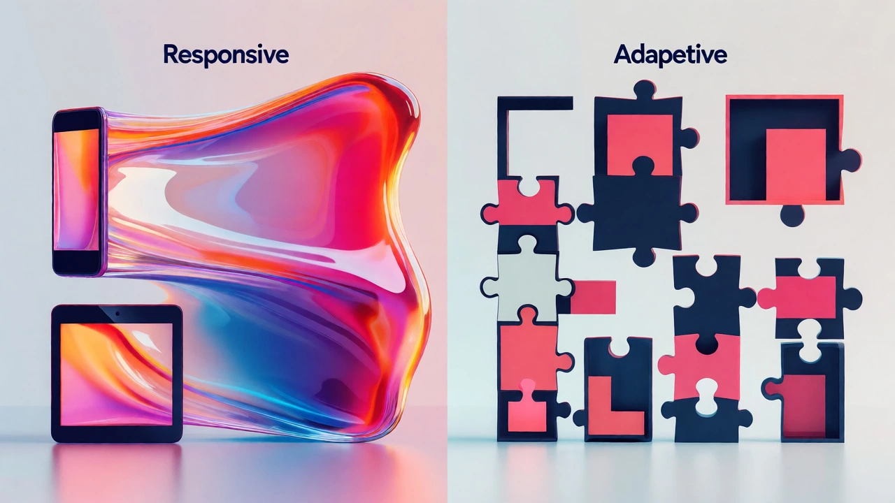
Drag the slider to change the simulated viewport width. Observe how a **Responsive** layout (left) scales continuously using percentages, while an **Adaptive** layout (right) snaps to fixed widths at specific breakpoints.
You’ve probably heard developers throw around terms like "responsive" and "adaptive" as if they’re interchangeable. They aren’t. If you’re using Bootstrap, you might be wondering which category it falls into. The short answer? Bootstrap is fundamentally a responsive web design framework. But that simple label hides some nuance that can trip up even experienced coders.
Why does this distinction matter? Because choosing between responsive and adaptive strategies affects your load times, maintenance costs, and how your site behaves on everything from a smartwatch to a 4K monitor. Let’s break down exactly how Bootstrap works, why it’s classified as responsive, and where the confusion usually starts.
The Core Difference: Fluid vs. Fixed
To understand Bootstrap, you first need to grasp the mechanical difference between the two approaches. It’s not just about semantics; it’s about how the browser renders your page.
Responsive Design uses fluid grids and flexible images. The layout changes continuously as you resize the window. Think of it like water filling a container-it adapts to any shape. This relies heavily on CSS media queries and percentage-based widths.
Adaptive Design, on the other hand, serves distinct layouts for specific screen sizes. If you have breakpoints at 320px, 768px, and 1920px, an adaptive site will detect the device width and serve one of those three fixed layouts. It doesn’t stretch; it swaps. This often requires server-side detection or JavaScript to decide which CSS file to load.
Bootstrap defaults to the responsive model. Its entire architecture is built on a fluid grid system that scales proportionally. When you drag your browser edge, the columns shrink smoothly until they hit a breakpoint, where they stack or reflow. That continuous scaling is the hallmark of responsiveness.
How Bootstrap’s Grid System Works
At the heart of Bootstrap lies its Grid System. In version 5, this is a 12-column flexbox-based grid. You don’t set pixel widths manually; you assign column spans (like `col-md-6`) that tell the browser how much space an element should take relative to its container.
Here’s the key mechanism:
- Container: The wrapper that centers your content and applies max-widths at specific breakpoints.
- Row: A horizontal group of columns. Rows use negative margins to offset column padding, ensuring alignment.
- Columns: These are the building blocks. Their width is calculated as a percentage of the row’s total width.
Because these widths are percentages, the layout is inherently fluid. If you change the viewport from 1200px to 1100px, the columns don’t jump to a new fixed size; they shrink by roughly 8%. This continuous adjustment is why we call it responsive.
| Feature | Bootstrap (Responsive) | Traditional Adaptive |
|---|---|---|
| Layout Strategy | Fluid, percentage-based | Fixed, pixel-based per breakpoint |
| Resizing Experience | Smooth, continuous scaling | Sudden jumps between layouts |
| CSS Loading | Single stylesheet with media queries | Multiple stylesheets or JS switching |
| Maintenance | Easier, single codebase | Harder, multiple layout versions |
| Performance | May load unused CSS initially | Loads only relevant CSS for device |
Where the Confusion Comes From
If Bootstrap is clearly responsive, why do people ask if it’s adaptive? Two main reasons.
First, the term "breakpoints." Bootstrap has predefined breakpoints (sm, md, lg, xl, xxl). Developers sometimes mistake these for adaptive triggers. In an adaptive model, hitting 768px means loading a completely different HTML structure or CSS file. In Bootstrap, hitting 768px simply activates a different set of CSS rules within the same file. The HTML structure remains largely identical; only the styling changes. This is still responsive behavior because the underlying DOM isn’t being swapped out based on device detection alone.
Second, older frameworks or custom implementations might mix both. Some developers use Bootstrap for the grid but add JavaScript logic to hide/show entire sections based on user-agent strings. If you’re doing that, you’re layering adaptive techniques on top of a responsive base. But out of the box, Bootstrap is purely responsive.
Can You Make Bootstrap Act Adaptive?
You can tweak Bootstrap to behave more like an adaptive site, though it requires extra work. By default, Bootstrap loads all CSS rules for all breakpoints in one large file. This can be inefficient for mobile users who never see desktop styles.
To mimic adaptive performance benefits, you can:
- Purge Unused CSS: Use tools like PurgeCSS to remove styles that don’t apply to your specific pages.
- Conditional Loading: Write custom JavaScript to detect screen size and dynamically inject specific CSS files, bypassing Bootstrap’s default single-file approach.
- Server-Side Rendering: Detect the User-Agent on the server and send a tailored HTML/CSS bundle before the browser even renders the page.
However, most modern teams stick with the standard responsive approach. Why? Because maintaining separate adaptive layouts doubles your testing surface. You’d need to verify every component on every supported resolution, rather than trusting the fluid grid to handle the middle ground.
Practical Implications for Your Project
So, what does this mean for your next build? If you choose Bootstrap, you’re betting on flexibility over precision. Here’s how to leverage that strength.
Test on Real Devices, Not Just Emulators. While Chrome DevTools is great for checking breakpoints, it doesn’t simulate touch interactions or actual rendering engines. Test on a low-end Android phone and an iPad. You’ll see how the fluid grid handles text wrapping and image scaling differently than a fixed adaptive layout would.
Optimize Images Correctly. Since the layout is fluid, your images must be too. Use the `` tag with `srcset` and `sizes` attributes. This tells the browser which image resolution to download based on the current viewport width. Without this, you might force a mobile user to download a 2000px-wide hero image, slowing down your site despite the responsive layout.
Avoid Hard-Coded Widths. One common mistake is adding inline styles like `style="width: 300px;"` inside a Bootstrap column. This breaks the fluid nature of the grid. Instead, use Bootstrap’s utility classes like `w-50` or `w-100`, or define widths in percentages within your custom CSS.
When Adaptive Might Still Be Better
Is responsive always the right choice? Not necessarily. Adaptive design shines when you have radically different experiences for mobile and desktop. For example, a complex data dashboard might require a simplified, tap-friendly interface on mobile that looks nothing like the dense desktop view. Trying to make one responsive layout do both jobs can result in a cluttered mobile experience.
In such cases, developers might use Bootstrap for the desktop version and a separate, lightweight adaptive template for mobile. Or they might use Bootstrap’s visibility utilities (`d-none d-md-block`) to hide heavy desktop components on small screens, effectively creating two distinct views within one responsive framework. This hybrid approach captures the best of both worlds: the ease of a single codebase with the performance benefits of targeted delivery.
Key Takeaways
- Bootstrap is Responsive: It uses fluid grids and media queries to scale continuously.
- Breakpoints ≠ Adaptive: Bootstrap’s breakpoints trigger style changes, not layout swaps.
- Performance Tip: Optimize images and purge unused CSS to mitigate the overhead of loading all styles.
- Hybrid Approach: Use visibility classes to create adaptive-like experiences within the responsive framework.
Understanding whether your framework is responsive or adaptive helps you make smarter architectural decisions. With Bootstrap, you’re getting a robust, battle-tested responsive system. Use it to its full potential by respecting its fluid nature, and you’ll save yourself countless hours of cross-browser debugging.
Does Bootstrap support adaptive design natively?
No, Bootstrap does not natively support adaptive design. It is designed as a responsive framework using fluid grids and CSS media queries. To achieve adaptive behavior, you must implement additional JavaScript or server-side logic to swap layouts or CSS files based on device detection.
What are Bootstrap's default breakpoints?
In Bootstrap 5, the default breakpoints are sm (≥576px), md (≥768px), lg (≥992px), xl (≥1200px), and xxl (≥1400px). These define where the layout shifts, such as stacking columns or changing container widths.
Is responsive design slower than adaptive design?
Not necessarily. Responsive design can be faster if optimized correctly because it avoids the latency of server-side device detection. However, if you load a massive CSS file containing rules for all devices on a mobile phone, initial render time may suffer. Tools like PurgeCSS help mitigate this.
Can I mix responsive and adaptive techniques in Bootstrap?
Yes. Many developers use Bootstrap's responsive grid for the overall layout while employing adaptive techniques for specific components. For instance, you might hide a complex sidebar on mobile using `d-none d-lg-block`, effectively serving a different visual experience without changing the core responsive structure.
Which is better for SEO: responsive or adaptive?
Google recommends responsive design. It simplifies crawling and indexing because there is only one URL and one HTML source code for all devices. Adaptive sites risk duplicate content issues if not configured carefully with canonical tags and proper redirects.