Responsive Design Visualizer
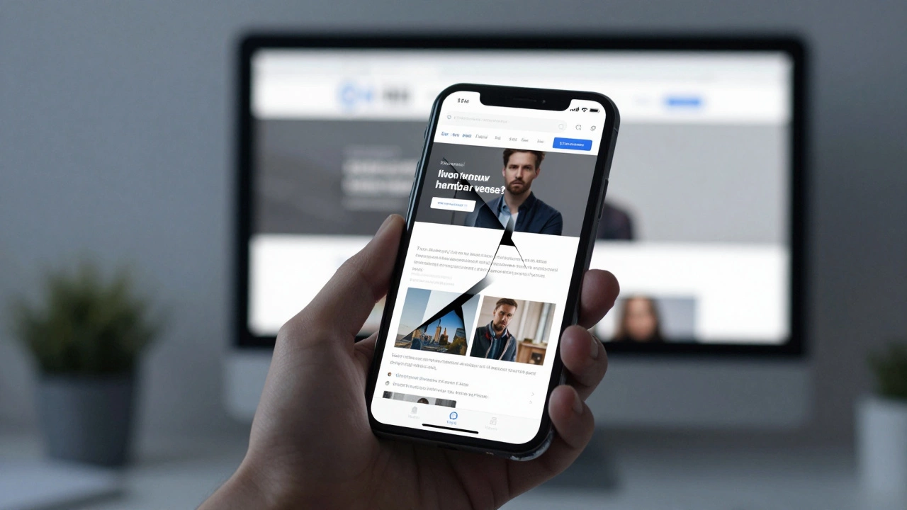
Device Simulator
Adjust the screen width to see how a responsive layout transforms based on the viewport size.
Quick Takeaways
- One codebase serves all devices, cutting maintenance time in half.
- Google prioritizes mobile-friendly sites in search results via mobile-first indexing.
- Better UX leads to lower bounce rates and higher conversion numbers.
- Fluid grids and flexible images replace rigid pixel-based layouts.
To understand why this approach wins, we first need to define what we're talking about. Responsive Web Design is a web development method that ensures a website's content and layout adjust automatically to the screen size and orientation of the device being used. Unlike the old way of doing things-where you'd build a separate "m.dot" site for mobile users-this approach uses a single set of HTML files that rearrange themselves based on the viewer's screen.
The Death of the Separate Mobile Site
Back in the day, companies built two versions of their site: a desktop version and a stripped-down mobile version. This was a logistical disaster. If you changed a price on your main page, you had to remember to change it on the mobile page too. If you forgot, you had inconsistent data, which kills trust. Using Responsive Web Design solves this by utilizing CSS3 Media Queries, which are basically instructions that tell the browser, "If the screen is narrower than 768 pixels, stack these columns vertically instead of horizontally." This means you manage one piece of content, and the browser handles the presentation. It's the difference between printing two different brochures for two different audiences versus having one digital document that reflows its text based on the app you use to read it.
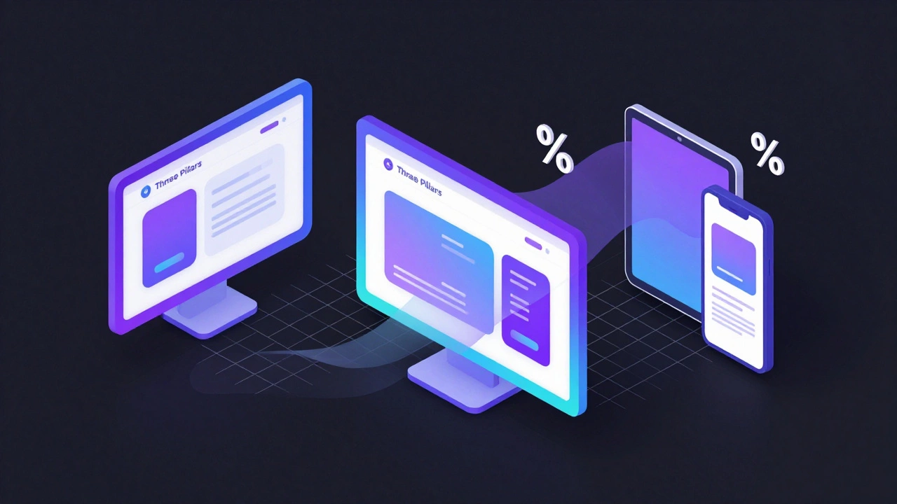
How it Actually Works: The Three Pillars
It isn't just about making things smaller. True responsiveness relies on three technical components working together. First, you have Fluid Grids. In the past, designers used fixed pixels (e.g., a sidebar that was exactly 300px wide). In a responsive setup, everything is defined in percentages. A sidebar might be 25% of the screen width. Whether that screen is a 30-inch monitor or a 5-inch phone, the proportion remains the same until a breakpoint tells it to change.
Then there are Flexible Images. Have you ever seen an image that stays at 800px wide while the rest of the page shrinks, forcing you to scroll horizontally? That's a failure of flexibility. Responsive sites use the "max-width: 100%" rule, ensuring an image never grows larger than its container but shrinks proportionally as the window closes.
Finally, we have the Media Queries. These act as the brain of the operation. They allow developers to apply different styles to different devices. For example, a navigation menu that is a horizontal bar on a laptop transforms into a "hamburger menu" (the three little lines) on a smartphone to save space.
| Attribute | Fixed Layout | Responsive Design |
|---|---|---|
| Unit of Measurement | Pixels (px) | Percentages (%) / Relative units (em, rem) |
| Maintenance | High (Multiple versions) | Low (Single codebase) |
| User Experience | Poor on mobile (Zooming required) | Seamless across all devices |
| SEO Impact | Risky (Duplicate content issues) | Positive (Google preferred) |
The SEO Power Play: Mobile-First Indexing
If you care about being found on Google, responsiveness isn't optional; it's a requirement. Google shifted to Mobile-First Indexing a few years ago. This means the search engine predominantly uses the mobile version of a site's content for indexing and ranking. If your site is clunky on mobile, Google assumes it's a bad experience for the user and pushes your ranking down. When you use responsive web design, you ensure that your metadata, headings, and content are identical across all devices, which removes the risk of "content mismatch" that used to happen with separate mobile sites. A study by the Mobile UX lab found that sites with a high level of responsiveness saw an average 15% increase in organic traffic simply because they stopped being penalized by search algorithms.
Impact on User Behavior and Conversions
Think about your own habits. If you click a link from a social media app and the page takes forever to load because it's trying to download a massive desktop image, or if the "Buy Now" button is so small you keep clicking the wrong thing, do you stay? Probably not. You bounce back to the search results. High bounce rates tell search engines that your page isn't helpful, creating a vicious cycle. On the flip side, a responsive site respects the user's context. A person on a desktop is likely in "deep work" or "shopping mode," while a person on a phone is often in "quick info" or "on-the-go" mode. By adjusting the layout-moving the most important call-to-action buttons to the thumb-zone (the bottom half of the screen)-you remove friction. This direct impact on User Experience (UX) is what turns a casual browser into a paying customer.

Common Pitfalls to Avoid
Not all "responsive" sites are created equal. One big mistake is over-relying on automatic scaling without testing. Some elements, like complex data tables, simply don't scale well. Instead of trying to shrink a 10-column table into a phone screen, a smart developer will turn that table into a series of "cards" or allow horizontal scrolling for that specific element only.
Another trap is ignoring load times. Just because a site is responsive doesn't mean it's fast. If you serve a 5MB image to a user on a 4G connection just because it "fits" the screen, you've failed. This is where Adaptive Images come in, allowing the server to send a smaller file size to mobile devices and a high-res version to desktops.
Future-Proofing Your Digital Presence
The landscape is changing. We aren't just dealing with phones and laptops anymore. We have foldable phones, tablets that act like laptops, ultra-wide monitors, and even screens integrated into cars. If you build for a specific device (like "iPhone 15"), your site will be obsolete in twelve months. By focusing on a fluid, responsive approach, you aren't designing for a device; you're designing for the *screen size*. This makes your site essentially future-proof. Whether the next big thing is a pair of AR glasses or a foldable screen that wraps around a wrist, a responsive site will adapt because it's based on the logic of the viewport, not the model number of the hardware.
Is responsive design the same as adaptive design?
Not quite. Responsive design uses fluid grids to flow seamlessly between any screen size. Adaptive design uses static layouts that "snap" into place based on a few predefined screen sizes (breakpoints). Responsive is generally considered more flexible and modern because it handles the infinite variety of screen sizes better than adaptive does.
Does a responsive site load slower than a dedicated mobile site?
It can if you aren't careful. Because a responsive site loads the same HTML for everyone, it might load more code than a stripped-down mobile site. However, with modern techniques like lazy loading, CSS minification, and adaptive image serving, the difference is negligible, and the SEO benefits far outweigh the minor overhead.
How do I check if my current website is actually responsive?
The easiest way is to open your site in a desktop browser (like Chrome), right-click and select "Inspect," then click the "Device Toolbar" icon (it looks like a phone and tablet). You can then drag the edge of the screen to shrink it. If the content reflows and you don't have to scroll horizontally to see the whole page, it's responsive.
Will making my site responsive help my Google rankings?
Yes, significantly. Google uses mobile-first indexing, meaning it primarily looks at the mobile version of your site to determine where you rank. A site that is hard to use on mobile will almost always rank lower than a responsive competitor, regardless of how good the desktop version looks.
Do I need to redesign my whole site to make it responsive?
Depending on how your site was built, you might not need a full redesign. If you're using a modern CMS like WordPress with a responsive theme, it's already done. If you have a custom-coded site with fixed widths, you'll likely need to update your CSS to use percentages and media queries, which is more of a technical overhaul than a visual redesign.
Next Steps for Business Owners
If you've realized your site is lagging behind, don't panic. Start by auditing your most visited pages. Use the browser inspector tool mentioned above to see where the layout breaks. If you're using a template, check if there's a "responsive" update available. If you're hiring a developer, make sure they follow a "Mobile-First" philosophy-meaning they design the smallest screen first and then add complexity as the screen gets larger. This ensures the most essential features are prioritized for the most common way people access the web today.