Most people browse the web on phones or tablets, so a site that looks good on a small screen isn’t optional—it’s a must. If your pages shrink, load slowly, or force users to zoom, they’ll leave in seconds and your rankings will suffer. A mobile‑friendly site automatically adjusts layout, text size, and navigation to fit any device, giving visitors a smooth experience without extra effort.
Google’s algorithms now favor mobile‑first sites, meaning the version it sees on a phone is the one it uses to rank you. That’s why even a great desktop design can hurt your traffic if it’s not optimized for mobile. The good news? You don’t need a whole redesign; a few focused changes can make a huge difference.
Start with a responsive framework. Whether you use CSS Grid, Flexbox, or a pre‑built system like Bootstrap, the layout should stretch and shrink based on screen width. Set meta viewport tags so browsers know how to scale content, and avoid fixed‑width elements that break on narrow screens.
Images are often the biggest slowdown. Use responsive image techniques—srcset and sizes attributes—to serve the right file size for each device. Compress JPEGs and PNGs, and consider modern formats like WebP for better quality at smaller sizes.
Touch targets matter. Buttons and links should be at least 44 × 44 px, with enough spacing to prevent accidental taps. Clear, concise headings help users skim quickly, and a simple navigation menu—often a hamburger icon or collapsible list—keeps the interface tidy.
After you make changes, test on real devices. Browser dev tools let you simulate phones, but nothing beats checking on an actual phone or tablet. Tools like Google’s Mobile-Friendly Test give you a quick score and point out issues such as small fonts or unclickable elements.
Performance tools such as PageSpeed Insights highlight speed problems specific to mobile, like render‑blocking scripts or large CSS files. Aim for a load time under three seconds; users on cellular connections will abandon slower pages.
Finally, keep an eye on analytics. Look for bounce rates and average session duration on mobile versus desktop. If mobile users leave early, revisit the pages with the highest drop‑off and apply the tips above.
By treating mobile as the default, you’ll improve SEO, keep visitors happy, and future‑proof your site as new devices hit the market. Ready to make your site mobile‑friendly? Start with a responsive template, optimise images, and test on real phones—your users (and Google) will thank you.

Learn how to transform any website into a responsive, mobile-friendly design with step-by-step instructions, essential tools, and a quick checklist.
Read More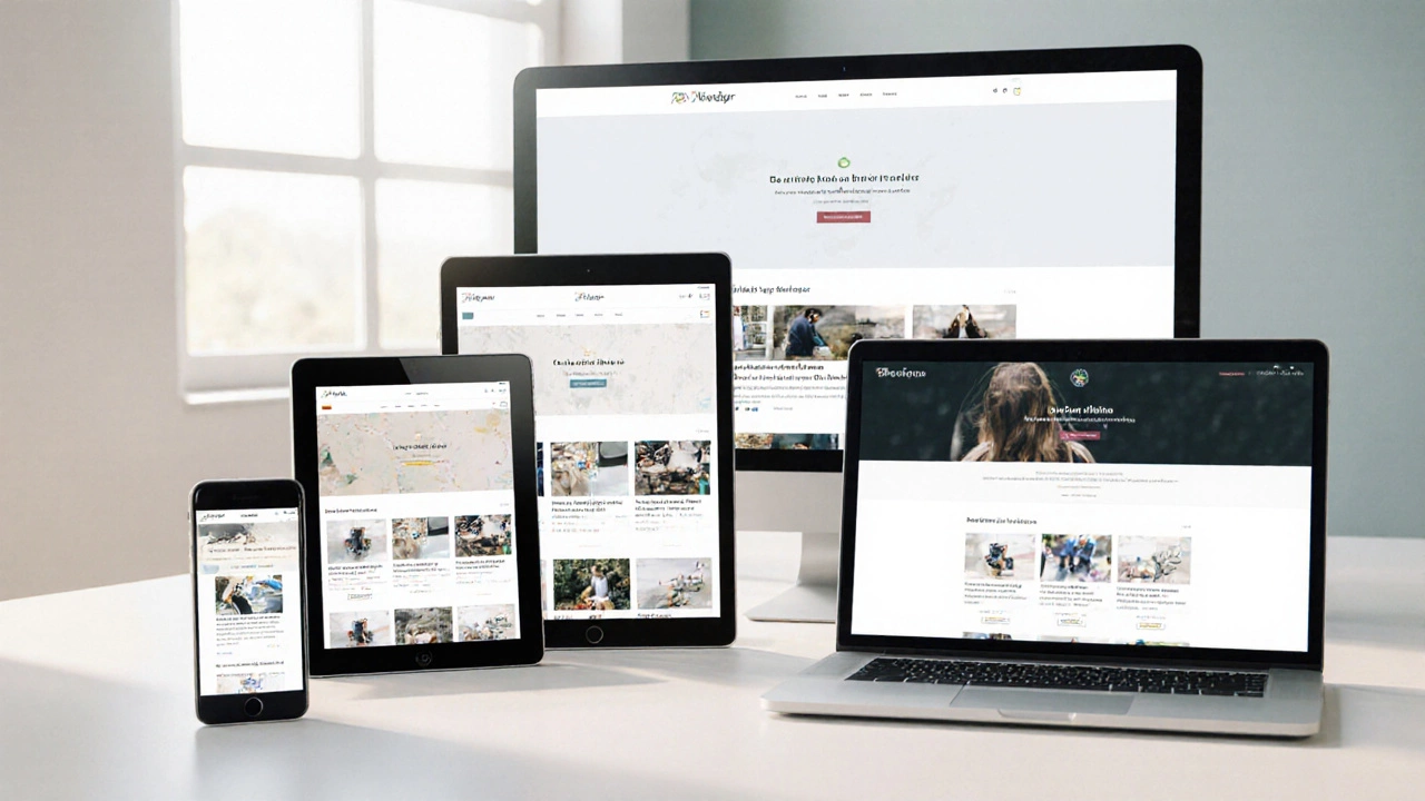
Discover the top 10 reasons why responsive web design is essential, from boosting SEO and conversions to cutting maintenance costs and future‑proofing your site.
Read More
Curious about website responsiveness? Learn how to spot if a site is responsive or adaptive, with simple tricks and expert insights. Perfect for anyone wanting clear answers.
Read More
A responsive website adapts seamlessly across various devices and screen sizes, which is crucial in today's diverse tech landscape. This article delves into the importance of having a responsive design, explains simple methods to test a website's responsiveness, and highlights useful tools that facilitate these checks. Understanding the signs of a responsive site ensures your audience gets the best user experience. With these insights, web developers and site owners can ensure their content remains accessible and engaging for every visitor.
Read More
Transforming an existing website into a responsive one involves adapting its layout and functionality to offer an optimized experience across different devices and screen sizes. This process includes examining the site's current structure, applying flexible grids, utilizing media queries, and ensuring touch-friendly interfaces. Emphasizing a mobile-first approach can lead to a more user-centered design, increasing visitor engagement and retention. The right tools and strategies are crucial for successfully transitioning your website into a fully responsive one.
Read More