When working with CSS media queries, a CSS feature that lets you apply styles based on device characteristics such as width, height, orientation, or resolution. Also known as media queries, it enables developers to create designs that adapt to different screens without duplicating code. In practice, responsive design responsive design, the approach of building fluid layouts that work on any device breakpoints, specific viewport widths where layout changes occur and mobile‑first, a strategy that starts styling for the smallest screens first rely on media queries to switch styles at the right moments.
First, a media query is just a conditional statement inside your CSS. It checks the viewport, the visible area of a web page on a device and decides whether to apply the enclosed rules. For example, @media (max-width: 768px) { … } targets tablets and phones, while @media (min-width: 1024px) { … } targets laptops and desktops. By stacking multiple queries you create a cascade of styles that fine‑tune the layout as the screen grows or shrinks.
The second piece is breakpoints, pre‑defined width values where the design shifts. These aren’t magic numbers; they stem from your content’s natural flow. A common set includes 320 px (small phones), 480 px (large phones), 768 px (tablets), 1024 px (small desktops), and 1440 px (large desktops). Choose breakpoints where the layout starts to feel cramped or where a new UI element can be introduced.
Third, the mobile‑first, approach that writes base styles for the smallest screens then adds larger‑screen rules flips the traditional workflow. Instead of writing a massive desktop stylesheet and overriding it for mobiles, you start lean, keep the CSS bundle small, and let the browser apply extra rules only when needed. This improves performance on slow connections and aligns with Core Web Vitals.
Another practical tip is to combine media queries with modern CSS functions like clamp(), min(), and max(). These let you set fluid sizes that automatically respect minimum and maximum limits, reducing the number of breakpoints you need. For instance, font-size: clamp(1rem, 2.5vw, 1.5rem); scales the text fluidly between 1 rem and 1.5 rem based on viewport width.
When you pair media queries with CSS Grid or Flexbox, you gain powerful layout control. A grid that switches from a single column on mobile to a multi‑column layout on desktop can be expressed with a single @media block that redefines grid-template-columns. This keeps your markup clean and your CSS declarative.
Performance matters, too. Each media query adds a tiny amount of processing for the browser. Group similar conditions, avoid overly specific queries, and place them at the end of your stylesheet so the parser can short‑circuit earlier rules. Tools like Chrome DevTools let you see which queries fire at different widths, helping you prune unused ones.
Beyond layout, media queries can detect other features: prefers-color-scheme for dark mode, prefers-reduced-motion for accessibility, and resolution for high‑DPI screens. By listening to these preferences, you create experiences that respect user choices without extra JavaScript.
Finally, remember that media queries are part of a broader responsive design ecosystem. They work hand‑in‑hand with fluid images, srcset, and vector graphics to ensure assets load at the right size. When you align your breakpoints with image breakpoints, you avoid unnecessary downloads and keep page weight low.
All these concepts—conditional styling, breakpoints, mobile‑first thinking, modern CSS functions, layout modules, performance tricks, and feature queries—form a toolbox that lets you build sites that look good and work fast on any device. Below you’ll find a curated selection of articles that dive deeper into each of these areas, from basics to advanced patterns, so you can start applying media queries with confidence.
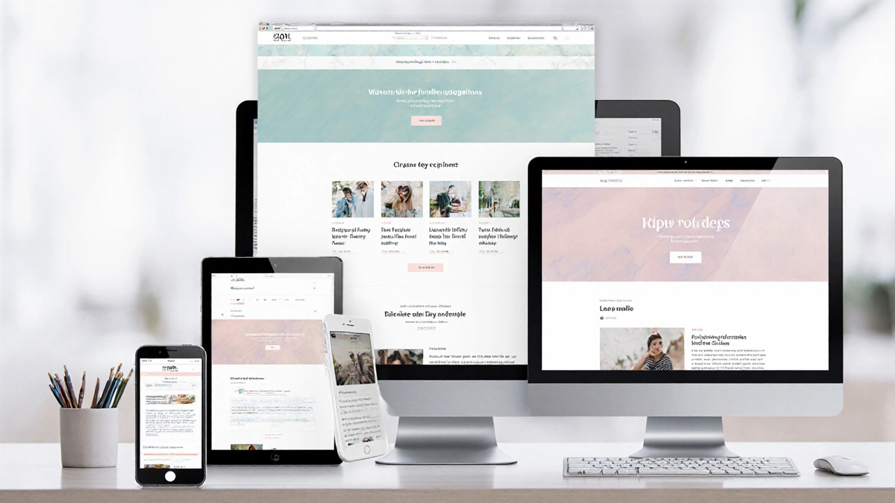
Responsive web design lets sites adapt to any screen size. Learn core techniques, step‑by‑step setup, common pitfalls, and FAQs to build fluid, mobile‑first experiences.
Read More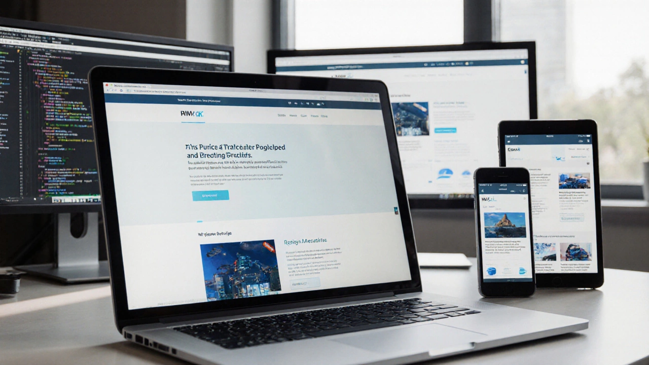
Learn how to transform any website into a responsive, mobile-friendly design with step-by-step instructions, essential tools, and a quick checklist.
Read More