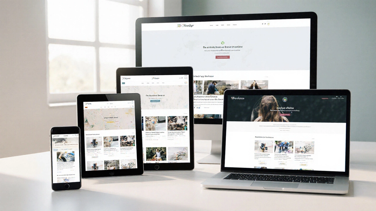
If your website looks perfect on a desktop but falls apart on a phone, you’ve missed a key step. Users bounce the moment they can’t read a headline or click a button. The good news? Making a site work on all devices is less about miracles and more about clear, practical steps.
First, understand the two main approaches: responsive and adaptive. Responsive design uses fluid grids and media queries so elements stretch or shrink based on screen size. Adaptive design, on the other hand, serves distinct layouts for predefined breakpoints. Both can achieve cross-device harmony, but responsive tends to be easier to maintain because you’re working with one codebase.
Designing for the smallest screen first forces you to strip away unnecessary clutter. Once the core layout works on a phone, you can enhance it for tablets and desktops. This approach also improves load speed—a major factor for SEO and user satisfaction.
Use flexible units like rem for fonts and percentage or fr for grid columns. Avoid fixed pixel widths unless you have a very specific element that must stay static. Tools like Chrome DevTools’ device toolbar let you preview how your CSS reacts at different widths without leaving the browser.
Relying on a single browser’s “responsive mode” isn’t enough. Real devices have different pixel densities, touch behaviors, and performance limits. Grab a cheap Android phone or an iPhone, open your site, and scroll through every page. Look for tap targets that are too small, text that overflows, or images that take forever to load.
Automation can help, too. Services such as BrowserStack or Sauce Labs let you run the same tests across dozens of devices in the cloud. Pair automated screenshots with manual spot‑checks for the best coverage.
When you spot issues, fix them with targeted CSS tweaks. For example, if a navigation menu drops off the screen on a small tablet, add a media query like @media (max-width: 768px) { … } to adjust the layout. Small, scoped changes keep your stylesheet readable.
Don’t forget performance. Compress images with WebP, enable lazy loading, and serve only the JavaScript you need. A fast, responsive site keeps users happy and boosts your search rankings.
Our recent articles dive deeper into these topics. "Responsive vs Adaptive Websites: How to Tell the Difference Easily" breaks down when to choose each method. "What Is Responsive Design? A Deep Dive Into User-Friendly Websites in 2025" explains the core principles you need to master. Both are great reads if you want to level up your cross-device skills.
Finally, make accessibility part of your compatibility checklist. Use sufficient colour contrast, proper heading hierarchy, and ARIA labels where needed. An accessible site works better for screen readers and for users on any device.
Cross-device compatibility isn’t a one‑off task; it’s an ongoing habit. Keep testing, stay up‑to‑date with browser updates, and refine your CSS as new devices hit the market. Follow these steps, and your site will feel natural whether it’s viewed on a watch, a phone, a laptop, or a large desktop screen.

Discover the top 10 reasons why responsive web design is essential, from boosting SEO and conversions to cutting maintenance costs and future‑proofing your site.
Read More
Creating an HTML website that seamlessly adapts to any device ensures optimal user experience and accessibility. This guide delves into effective strategies for achieving cross-device compatibility in web design. Learn how to utilize flexible layouts, implement media queries, and optimize images for responsiveness. Discover essential tips and common pitfalls to avoid when crafting a versatile and dynamic website.
Read More