Responsiveness Guide: Which One Do You Need?
Confusion is common because both use the word "Responsive." Select the scenario that best describes your current goal to see which concept applies to you.
"I want to get more people to see my business on other websites."
I have images and headlines, and I want them to fit perfectly into various ad slots across the web.
"I want my site to look great on iPhones and Desktops."
I want my layout to reorganize itself and be readable without users having to pinch and zoom.
Select a scenario above to see the difference...
The Big Confusion: Ads vs. Layouts
If you've been searching for "responsive" in the context of Google, you've probably noticed that the word pops up in two completely different worlds. One is about how a website looks on a phone, and the other is about how an ad looks on a website. It's a classic case of the same word meaning two very different things. If you mix these up, you might find yourself trying to "design" an ad using CSS grid or trying to "bid" on a website layout in an ad manager.
To clear this up: Google Display Network is a collection of millions of websites, apps, and videos where Google places ads. When people talk about "Responsive Display Ads," they are talking about a specific type of marketing tool. On the other hand, Responsive Web Design is an approach to web development that makes page layouts change based on the screen size of the device. One is a way to reach customers; the other is a way to build a site.
Key Takeaways
- Google Display refers to the advertising network (the "where") and the ad formats (the "what").
- Responsive Web Design refers to the technical build of a website (the "how it works").
- Responsive ads use AI to swap assets; responsive websites use CSS to shift layouts.
- You need a responsive website to ensure the people clicking your Google Display ads have a good experience.
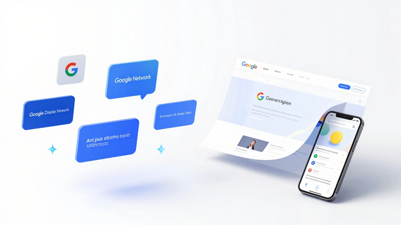
What Exactly is the Google Display Network?
Imagine you're browsing a cooking blog or reading a news article and you see a banner ad on the side. That's likely the Google Display Network (GDN) at work. It's a massive system that allows advertisers to place visual ads across a huge web of partner sites. Unlike search ads, which only show up when someone searches for a specific keyword, display ads are "push" marketing. They find people based on their interests or the content they are currently consuming.
Within this world, there is a specific product called Responsive Display Ads. These are a lifesaver for marketers. Instead of designing ten different banner sizes (like 300x250 or 728x90), you just give Google a few images, a couple of headlines, and a logo. Google's AI then mixes and matches these assets to fit whatever space is available on the host website. If the site has a tiny square slot, Google makes a square ad. If it's a wide banner, Google stretches the content. It's an automated way to ensure your ad always looks "right," regardless of where it lands.
Breaking Down Responsive Web Design
Now, let's move away from advertising and talk about building. Responsive Web Design (RWD) is the gold standard for how we build the internet today. Back in the day, companies would build a "mobile site" (usually something like m.website.com) that was a stripped-down version of the main site. That was a nightmare to maintain.
RWD changed that by using CSS (Cascading Style Sheets) to create a fluid grid. The most critical tool here is the Media Query. This is a bit of code that tells the browser: "If the screen is narrower than 768 pixels, move this sidebar to the bottom and make the font bigger." This ensures that whether someone is using a 30-inch monitor or a 5-inch iPhone, the site is usable and readable without them having to pinch and zoom.
A truly responsive site doesn't just shrink things; it reorganizes them. A three-column layout on a desktop might become a single-column stack on a phone. This is not managed by an AI-like Google's ads are-but by a developer who writes specific rules for different "breakpoints."
Comparing the Two: A Side-by-Side Look
| Feature | Responsive Display Ads | Responsive Web Design |
|---|---|---|
| Core Purpose | Marketing and Lead Gen | User Experience and Accessibility |
| Control | Google AI decides the final look | Developer defines the exact layout |
| Inputs | Images, headlines, logos | HTML, CSS, JavaScript |
| Platform | External websites/apps | Your own website |
| Goal | Maximize clicks (CTR) | Maximize usability and retention |
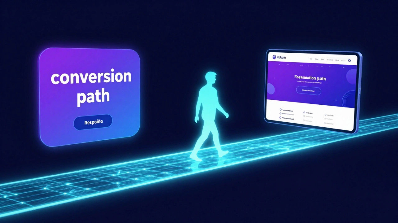
The Secret Connection: Why You Need Both
While they are different things, they work together in a cycle. If you spend $5,000 on responsive web design for your landing page, your Google Display ads will perform better. Why? Because the "conversion path" is seamless. Imagine a user clicking a beautiful, responsive ad on their phone. If that ad leads to a non-responsive website where the text is tiny and the buttons are impossible to click, the user will bounce instantly. You've just wasted your ad spend.
This is where User Experience (UX) becomes the bridge. Google actually tracks this. If your landing page has a high bounce rate because it isn't responsive, Google may increase your Cost Per Click (CPC) or lower your ad quality score. In a very real sense, the quality of your web design dictates the cost of your advertising.
Common Pitfalls to Avoid
One of the biggest mistakes I see is the "image trap." In Responsive Display Ads, people upload one perfectly cropped image, forgetting that Google will crop it differently for different formats. Always provide multiple aspect ratios (square and landscape) to give the AI a better chance of success.
On the web design side, the biggest mistake is "designing for the device" instead of "designing for the content." Don't just make a mobile version; use a Mobile-First Approach. Start with the smallest screen and add complexity as the screen gets wider. It's much easier to expand a layout than it is to shrink a complex desktop site into a tiny phone screen.
Another trap is relying too heavily on automatic "responsive' plugins' in tools like WordPress. While they help, they often create bloated code that slows down your site. A slow site kills your conversion rate, even if it "looks" responsive. Always check your site's speed using tools like PageSpeed Insights to ensure your responsive layout isn't weighing down the experience.
The Future of Responsiveness
We are moving beyond just screen sizes. We're now seeing "adaptive" designs that respond to the user's connection speed or the specific input method (touch vs. mouse). In the ad world, we're seeing more Dynamic Creative Optimization (DCO), which goes beyond basic responsiveness by changing the ad content based on the user's real-time data, like the local weather in Leeds or their browsing history.
The line between an ad and a piece of content is blurring. High-performing display ads now look less like "ads" and more like native articles. This requires a deep understanding of both the marketing side (Google Display) and the technical side (Responsive Design) to ensure the transition from ad to page feels natural and invisible.
Can I have a responsive website but non-responsive ads?
Yes. You can use "Static Image Ads" on the Google Display Network, where you upload a fixed file (like a JPG) of a specific size. However, this is generally less effective because you have to create dozens of different versions to cover all possible ad slots, whereas responsive ads do this automatically.
Does Google's responsive ad AI affect my branding?
It can. Because Google mixes and matches your headlines and images, you don't have 100% control over every single combination. To keep your brand consistent, use high-quality assets that work well together and avoid overly specific phrasing in your headlines that might sound weird when paired with a different image.
Which is more important for SEO: responsive design or ad spend?
For organic rankings, responsive design is far more important. Google uses "mobile-first indexing," meaning it primarily looks at the mobile version of your site to determine your rank. Ad spend helps you get traffic, but it doesn't improve your organic SEO position in the long run.
How do I test if my website is actually responsive?
The easiest way is to open your site in a browser like Chrome, right-click, select "Inspect," and click the "Toggle Device Toolbar" icon (it looks like a phone and tablet). This allows you to simulate various screen sizes and see exactly how your layout shifts in real-time.
Are responsive ads more expensive than static ads?
Not necessarily. You pay based on the same auction system (CPC or CPM). However, responsive ads often have a better Return on Investment (ROI) because they reach more placements and usually have a higher click-through rate due to their optimized fit.
Next Steps and Troubleshooting
If you're just starting out, don't try to master both at once. First, audit your website. If your site isn't responsive, stop your ad spend immediately. Fixing your site is the priority because a leaky bucket (a bad website) can't hold water (traffic).
For those who have a responsive site and want to start advertising, begin with a small budget in the Google Display Network. Upload at least five different images and five different headlines. Let Google's AI run for two weeks without changing anything-this is the "learning phase." Once the data comes in, look at which combinations performed best and replace the low-performing assets with new variations.
If you notice your ads are looking stretched or weird, check your image aspect ratios. Ensure you have both a 1.91:1 (landscape) and a 1:1 (square) version of your key visuals. This gives the system the flexibility it needs to look professional across all platforms.