Looking for solid advice on web design without the jargon? You’re in the right place. Below you’ll find short, practical articles that cover everything from responsive layouts to SEO‑friendly URLs. Whether you’re a freelancer, a small‑business owner or just curious, these posts give you clear steps you can apply today.
Here’s what’s fresh on our tag page. Each piece is written in plain English and focuses on real‑world problems.
Each article includes real examples, step‑by‑step actions and a short recap so you can skim and still walk away with something useful.
A well‑designed site does more than look pretty. It guides visitors, speeds up loading times and tells search engines what you’re about. When you combine clean visuals with solid SEO practices, you get higher conversion rates and lower bounce rates. That’s why we focus on practical design tips that also boost rankings.
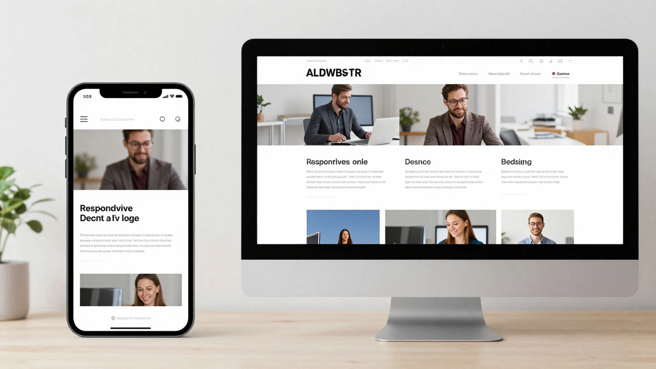
First, make your site mobile‑friendly. Google now uses mobile‑first indexing, so a responsive layout isn’t optional. Use flexible grids, relative units like % or vw, and test on real devices before you launch.
Second, keep navigation simple. A user should find the main page in three clicks or less. Clear menus, breadcrumb trails and descriptive link text improve both user experience and crawlability.
Third, choose fast, lightweight assets. Compress images, serve next‑gen formats (WebP, AVIF) and minify CSS/JS. A site that loads in under three seconds keeps visitors and pleases Google.
Finally, don’t forget accessibility. Proper heading hierarchy, alt text for images and sufficient colour contrast help everyone use your site and can earn you a bonus in search rankings.
Putting these basics together creates a strong foundation. From there, you can experiment with advanced effects—animations, custom fonts, interactive widgets—without hurting performance.
Need more detailed help? Browse the articles above, pick a topic that matches your current challenge, and start applying the steps today. Good web design isn’t a one‑time project; it’s a habit of checking, tweaking and improving as technology and user expectations evolve.
Responsive websites adjust layout for screen size; dynamic websites change content based on user or context. Learn how they differ and which one your project needs.
Read More
Explore what truly defines responsive design in 2025, why it matters, how it works, and how you can make your website more user-friendly for every device.
Read More
Responsive design styles have transformed the digital landscape by allowing web designs to adjust seamlessly to various screen sizes. This approach ensures enhanced user experiences across devices, from desktops to smartphones. The article dives into key aspects of responsive design, offering insights into popular techniques and important considerations for designers. Tips on optimizing content and choosing the right frameworks are also discussed.
Read More