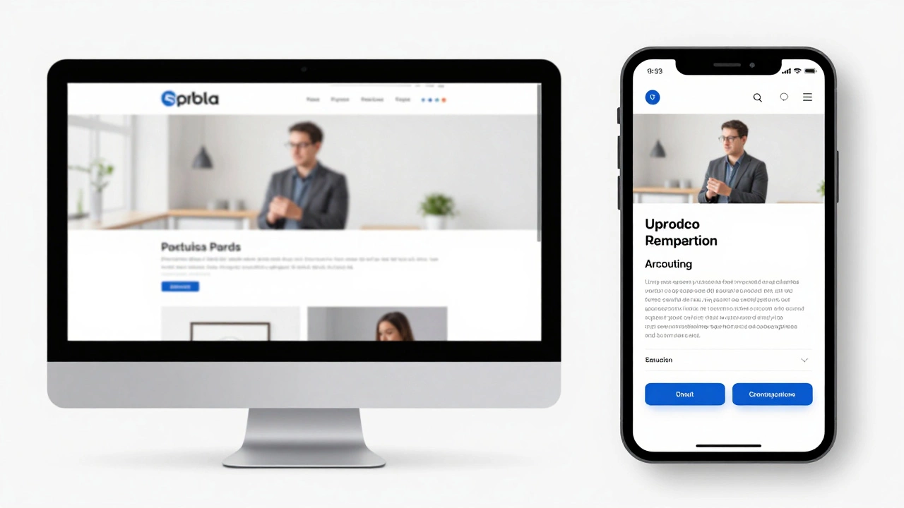
Responsive design ensures websites work seamlessly across all devices - from phones to desktops. It's not optional anymore. Learn how fluid grids, media queries, and mobile-first thinking create better user experiences and boost SEO.