When users land on a page, the first thing they notice is how it looks and how easy it is to use. Good UI design bridges that gap – it makes a site look sharp and guides visitors to what matters most. You don’t need a design degree to get there; a few solid habits can lift any site’s user experience.
A clear, attractive interface does more than please the eye. It reduces confusion, speeds up tasks, and builds trust. When buttons are placed where eyes expect them, or text hierarchy leads the reader naturally, bounce rates drop and conversions rise. In short, UI is the silent salesperson that works 24/7 without saying a word.
Start with spacing. Consistent margins and padding give a page breathing room, making content easier to scan. Try a base spacing unit – for example, 8 px – and multiply it for larger gaps. Next, pick a limited color palette. Two primary colors plus a neutral work better than a rainbow of shades; they create visual unity and keep the eye focused.
Typography is another low‑effort win. Use one font family for headings and another for body text, but limit the total to two or three styles. Set a clear hierarchy: H1 bigger, H2 slightly smaller, and so on. This hierarchy tells users what’s important without them having to think.
Buttons should stand out without screaming. Give them a distinct background color, enough padding, and a subtle hover effect. Consistency is key – a button that looks different on each page breaks trust. Test your button sizes on mobile; a thumb‑friendly area of at least 44 px ensures users can tap without frustration.
Images and icons need the same visual language as the rest of the site. Use the same style (flat, line, or detailed) and keep dimensions consistent. Crop photos to the same aspect ratio, and compress them to improve load speed – a fast site feels smoother to use.
Finally, think about feedback. When a user clicks, submits a form, or encounters an error, give a clear response. A small check‑mark, a brief message, or a color change tells them the action succeeded or needs fixing. That tiny interaction can make the whole experience feel polished.
Putting these tweaks together creates a UI that feels intentional, trustworthy, and easy to navigate. You don’t need to overhaul the whole design overnight; start with one area, measure the impact, and iterate. Over time, those small steps add up to a site that looks professional and performs better for both users and search engines.
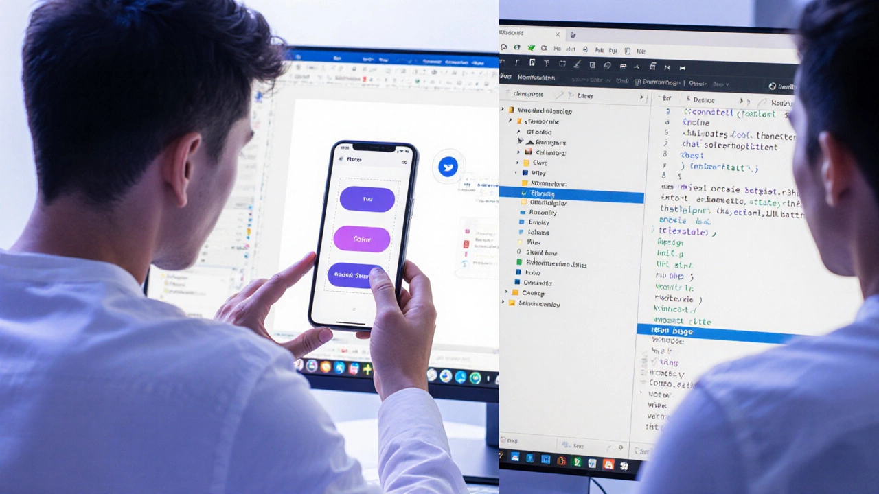
Figma is used for designing interfaces, creating clickable prototypes, building design systems, and collaborating in real time. It’s the go-to tool for UX/UI teams because it replaces messy file sharing with live, shared design work.
Read More
Is UX really harder than UI? Discover the myths, truths, and surprising facts that separate these two crucial design disciplines.
Read More