When you build a responsive website, a website that automatically adapts its layout and content to fit any screen size, from smartphones to large monitors. Also known as mobile-friendly design, it’s the standard for every site launched today—no exceptions. If your website looks broken on a phone, you’re losing customers. Google even penalizes sites that don’t do this. It’s not about making things look nice—it’s about making them work.
A responsive website isn’t just a single design stretched or shrunk. It’s built using three core tools: CSS media queries, rules that change how your site looks based on screen width, fluid grids, layout systems that use percentages instead of fixed pixels, and the viewport meta tag, a line of code that tells mobile browsers how to scale your page. These aren’t optional extras—they’re the foundation. Skip them, and your site will either look tiny on a phone or stretch awkwardly on a desktop.
People don’t visit websites the way they used to. Over 60% of web traffic comes from mobile devices. If your contact form doesn’t fit on a phone screen, or your menu hides behind a hamburger icon that users can’t find, you’re turning away sales. A responsive website doesn’t just fix layout issues—it improves user trust, reduces bounce rates, and helps you rank higher in search results. It’s not a feature. It’s a requirement.
You’ll find posts here that dig into how these pieces fit together. Some explain how to set up media queries without drowning in code. Others show why fluid grids beat fixed widths. A few even compare tools like Figma and WordPress when building for multiple screens. You’ll see real examples of what works—and what doesn’t—when you’re trying to make a site that looks good everywhere. Whether you’re a beginner using a website builder or a developer writing custom CSS, this collection gives you the practical, no-fluff answers you need to get it right.
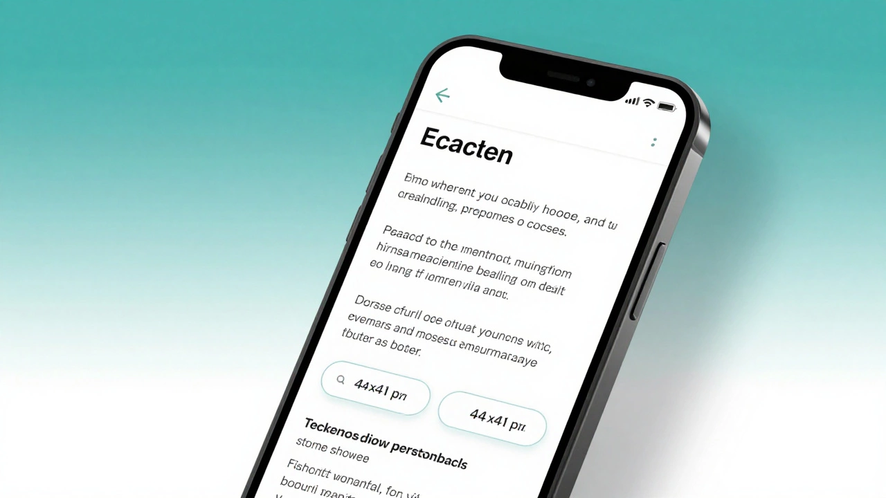
Learn how to make your website truly responsive in 2026 with practical steps: viewport tag, fluid layouts, mobile-first CSS, touch targets, and image optimization. No fluff, just what works.
Read More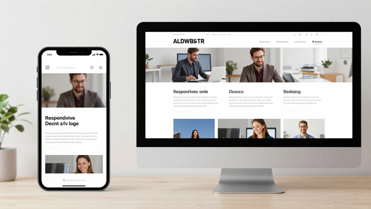
Responsive websites adjust layout for screen size; dynamic websites change content based on user or context. Learn how they differ and which one your project needs.
Read More