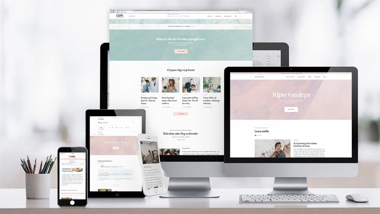
When you build a website starting with the mobile-first design, an approach where you design for small screens before scaling up to larger ones. Also known as mobile-oriented design, it means your site works perfectly on a phone before you even think about desktop. This isn’t optional anymore. Over 60% of web traffic comes from mobile devices, and Google uses mobile performance as its main ranking signal. If your site feels slow, clunky, or broken on a phone, users leave—and search engines punish you for it.
Mobile-first design isn’t just about shrinking a desktop layout. It’s about rethinking priorities: what content matters most on a tiny screen? How fast does it load? Can users tap buttons without frustration? This approach forces you to cut the fluff, focus on core tasks, and build clean, fast experiences. It directly ties into responsive web design, a technique that lets a site adjust its layout based on screen size, but goes further by making mobile the starting point, not an afterthought. You can’t just slap on media queries and call it done. You need to plan your content hierarchy, navigation, and performance from the ground up.
Tools like CSS grids, flexible images, and viewport meta tags are part of the toolkit, but the real win comes from mindset. A mobile-friendly, a site that’s easy to use and navigate on smartphones isn’t just about size—it’s about speed, touch targets, and clear calls to action. Think about how people actually use phones: one thumb, bad lighting, spotty Wi-Fi. Your site needs to handle that. That’s why performance matters as much as layout. A slow mobile site kills conversions, no matter how pretty it looks.
And it’s not just developers who need to care. Designers, marketers, and business owners all play a role. If your UX design ignores mobile behavior, you’re losing customers before they even get to your product. That’s why so many posts here cover related topics—like how to make a site responsive, why mobile speed affects SEO, and how to test your site on real devices. You’ll find practical guides on testing layouts, optimizing images, and avoiding common mobile pitfalls.
What you’ll find below aren’t just theory-heavy articles. These are real-world checks, step-by-step fixes, and honest takes on what works—and what doesn’t—when you build for mobile first. Whether you’re a freelancer, a small business owner, or just trying to improve your site, the posts here give you the tools to get it right without the hype.

Responsive web design lets sites adapt to any screen size. Learn core techniques, step‑by‑step setup, common pitfalls, and FAQs to build fluid, mobile‑first experiences.
Read More